Cosmic Vinyl
Brand identity transformation for the record store cafe hybrid to capture its eclectic, quirky essence and modernize its look.
MY ROLE
Brand Designer
TIMELINE
3 months
WHO IS COSMIC VINYL?
Cosmic Vinyl is a vegan cafe and record store hybrid located in Echo Park, an LA neighborhood known for its diversity, trendy local businesses, and creatives.
CONTEXT
For this project, I designed a new brand identity for Cosmic Vinyl to captures its eclectic, quirky essence and reflect the rich cultural diversity of its surrounding environment.
Disclaimer: This project is a conceptual work (completed as a design exercise and personal exploration).
Assessing the Brand
An audit of Cosmic Vinyl's brand revealed inconsistencies in brand application and an overall outdated design system.
The first step in the rebranding process involved researching the brand context (background, audience, setting), auditing the brand's visual presence.
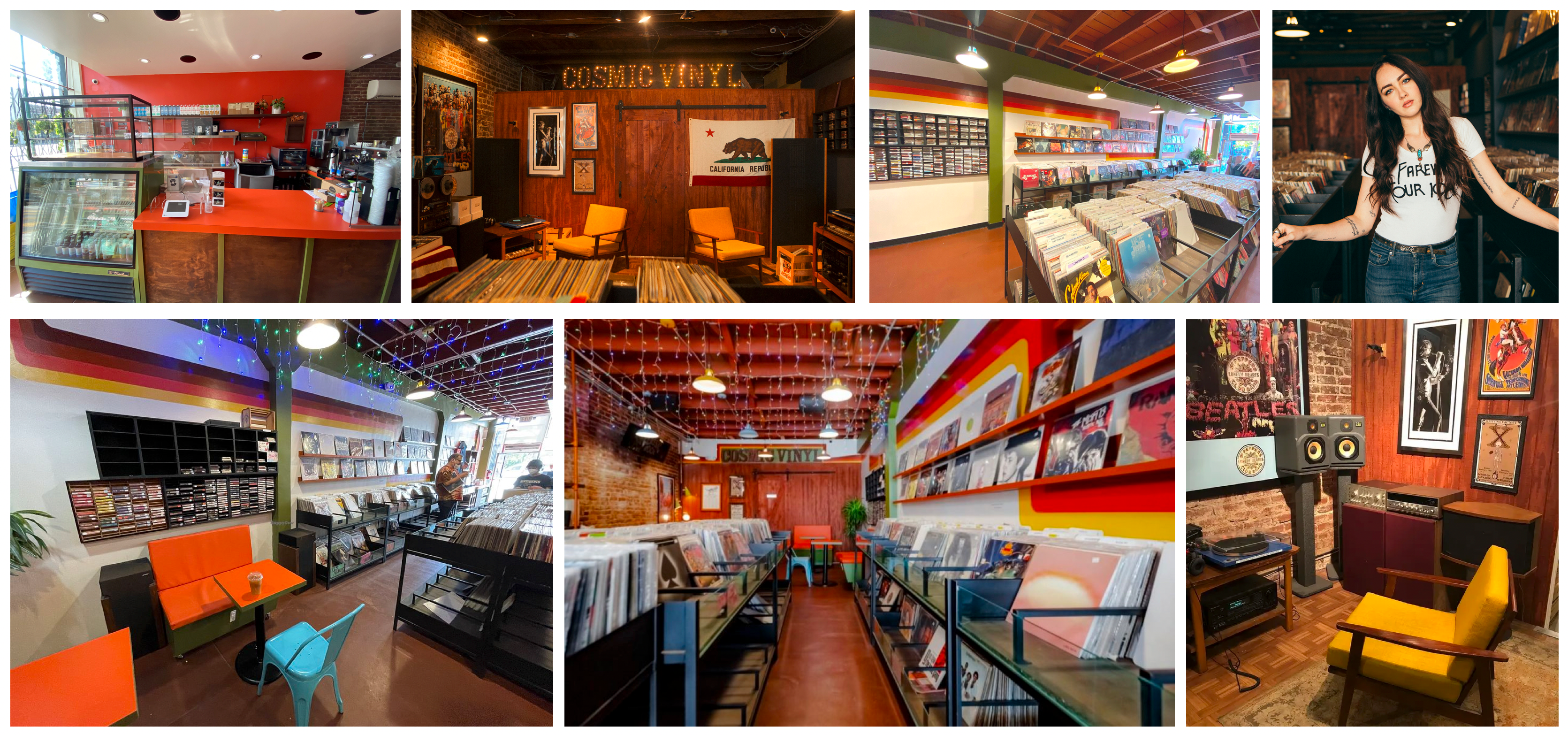
Environmental Brand Audit (Store)
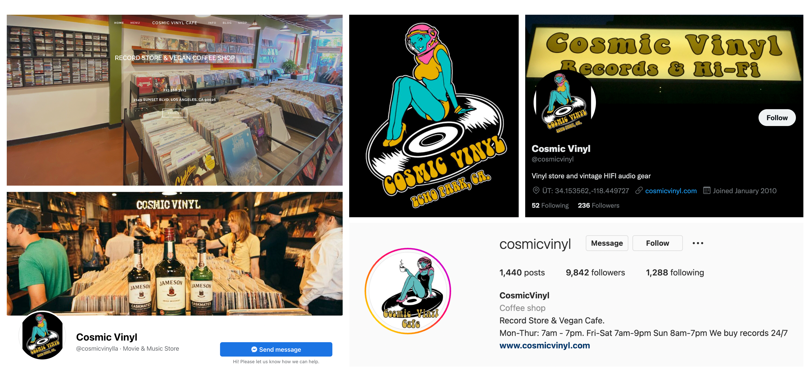
Digital Brand Audit
Customer Satisfaction Audit
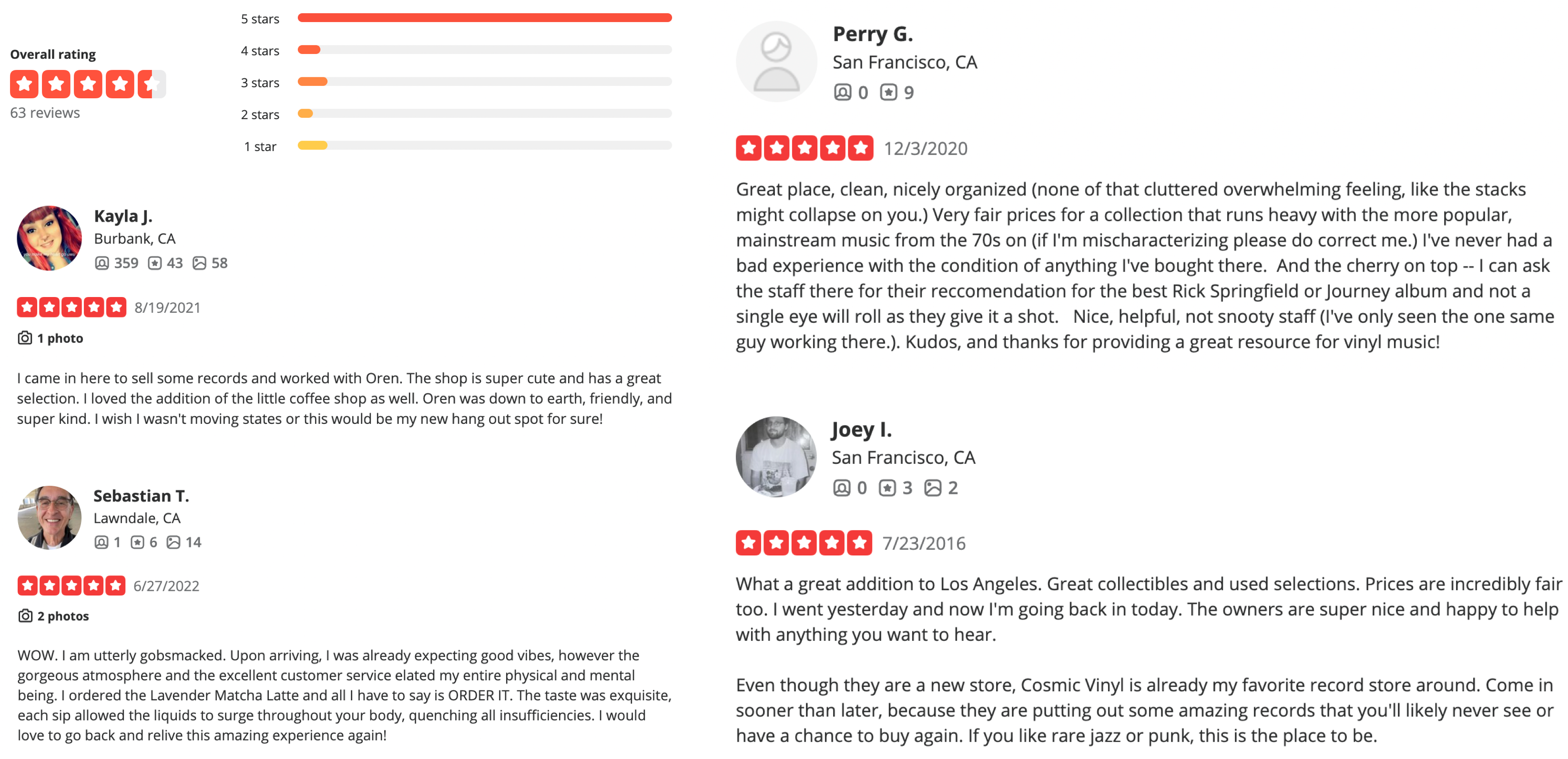
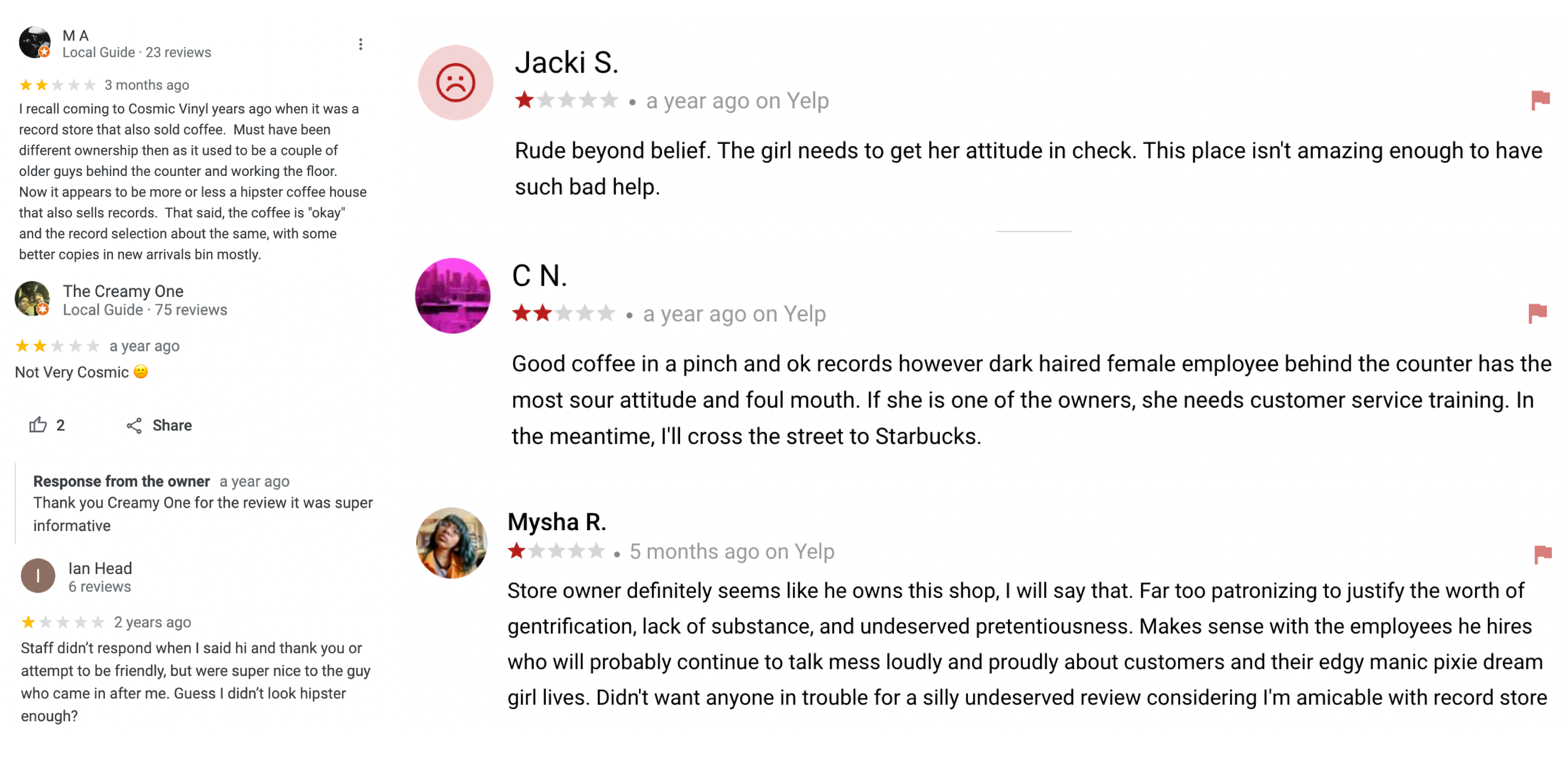
I then conducted a comprehensive audit of all customer reviews for Cosmic Vinyl, pulling out insights on what people liked most, areas for growth, and general perception of the brand.
Strengths: Cozy atmosphere & relaxing ambience, friendly staff & great customer service, excellent food and record selection.
Weaknesses: Overly "hipster" feeling isolates a significant portion of customers.
Brand Problem Identification
Based on my research, I identified two key gaps in the current branding:
Inconsistent Application
✦ Mix of two different brand images
✦ Different logo designs on various platforms
✦ No set typeface, color palette, etc.
Incomprehensive Brand Image
✦ Failure to effectively convey hybrid model
✦ Imbalance in cafe & record store portrayal
✦ Brand personality lacking in logo & web design
Competitor Benchmarking
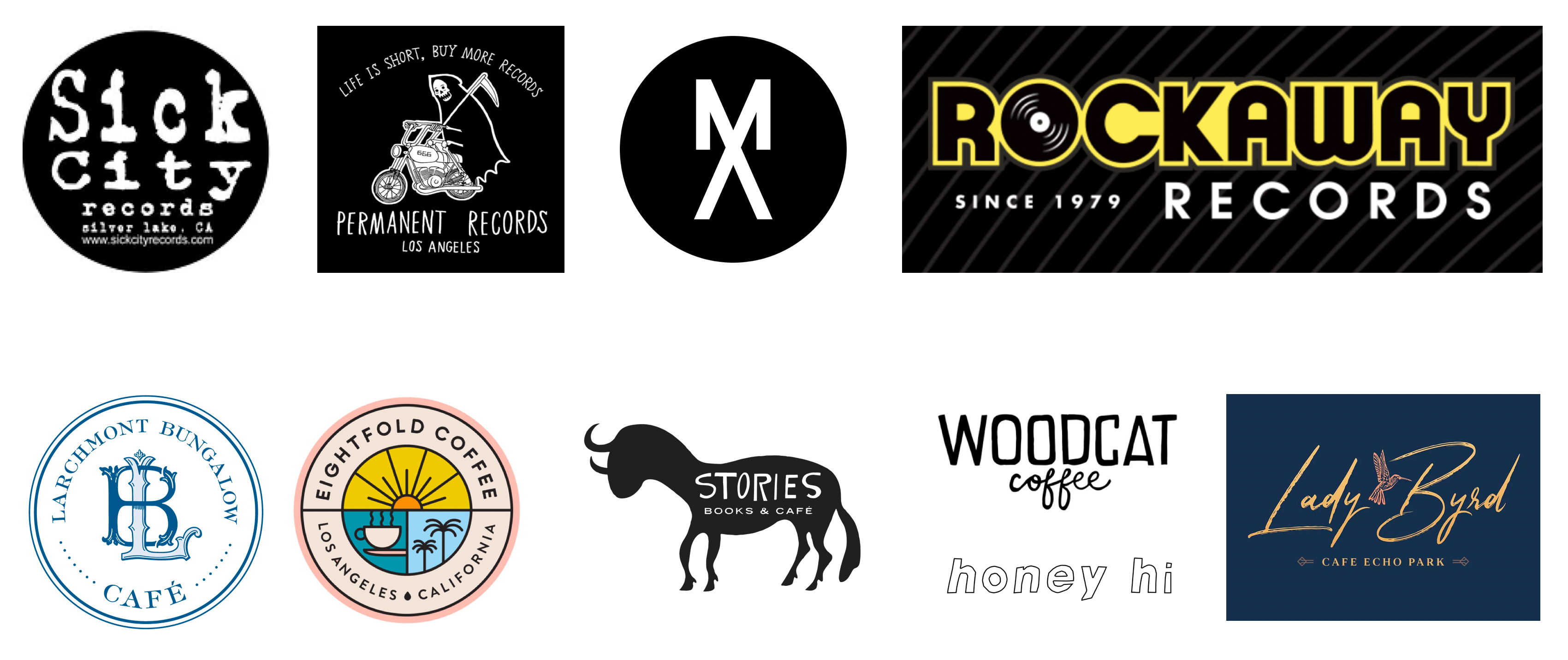
Lastly, I audited competitors in the food and beverage space (predominately cafes) as well as other record stores to gather insights into industry trends and potential differentiators.
Cafe Brand Trends: Handwritten fonts, organic design elements, soft and delicate themes.
Record Store Trends: Predominately black colored branding with yellow accents, blocky modular fonts, grungy textures and patterns.
Redefining the Brand
Brand Personality
Following the brand assessment, the brand was redefined under three new brand adjectives that better captured the spirit of Cosmic Vinyl: Artistic, Zany, and Eclectic.
Artistic: Cosmic Vinyl reflects the vibrant creative sphere of its surrounding neighborhood. It promotes exploration of and engagement with its diverse community of musicians, artists, and creatives.
Zany: Cosmic Vinyl reflects a unique, personable, and down-to-earth tone, crafting a welcoming and inclusive environment for both cafe lovers and music novices and enthusiasts alike. It is authentic, relatable, and candid.
Eclectic: Cosmic Vinyl mirrors the rich cultural diversity of its surrounding environment that draws in locals and tourists alike. The brand highlights its dynamic and eclectic mix of vintage records and trendy vegan cuisine.
Reimagining the Brand Part 1: Visual Identity
An eclectic & quirky identity balancing retro aesthetics with modern design.
The new identity introduces a more selective color palette while retaining the brand’s eclectic visual personality.
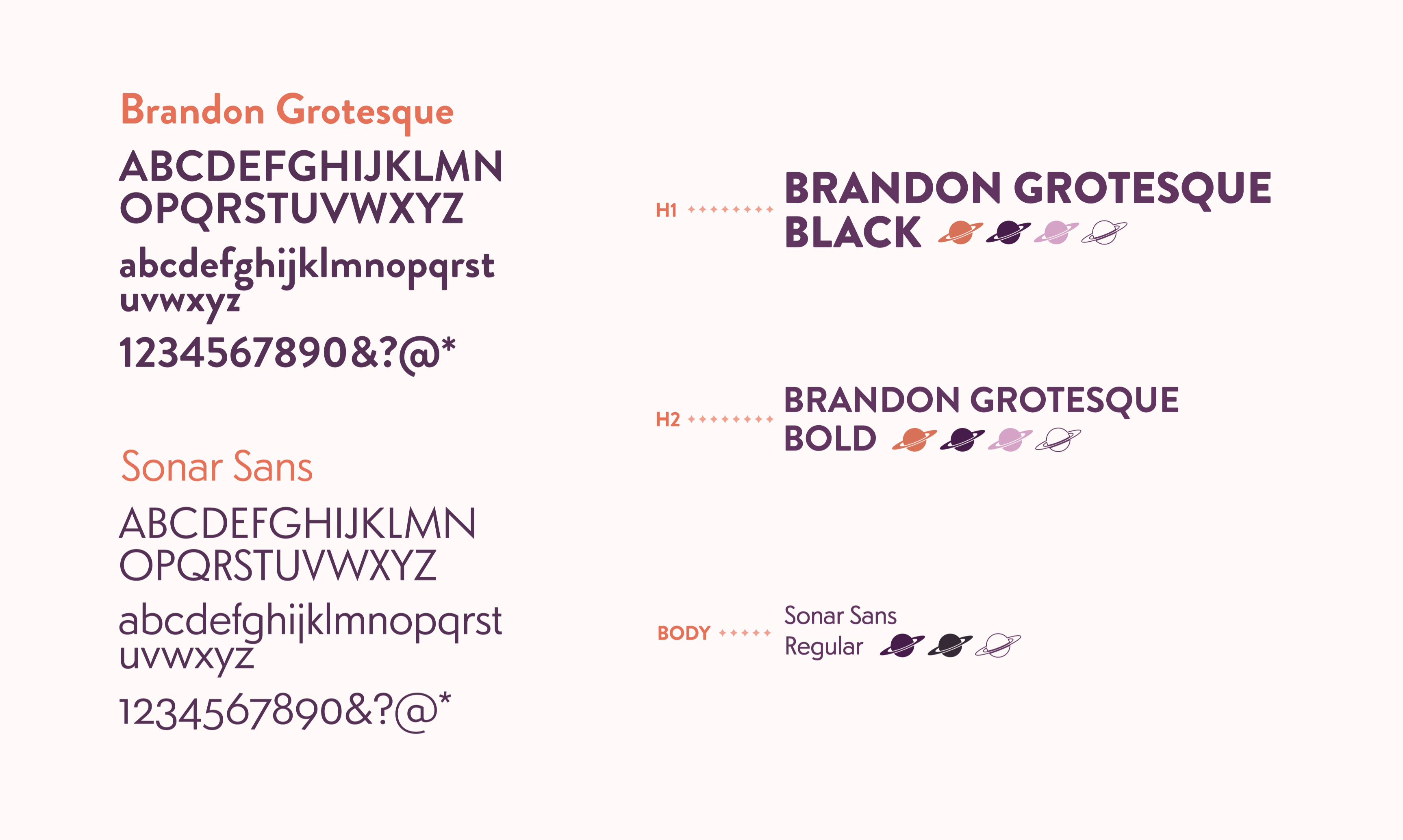
The round and robust nature of the brand typography compliments the circular logomark and distinguishes the brand from stereotypical bold, condensed “record store” fonts

Color Palette
Brand Typography
Reimagining the Brand Part 2: Logo Design
The Logo: From Paper to Screen
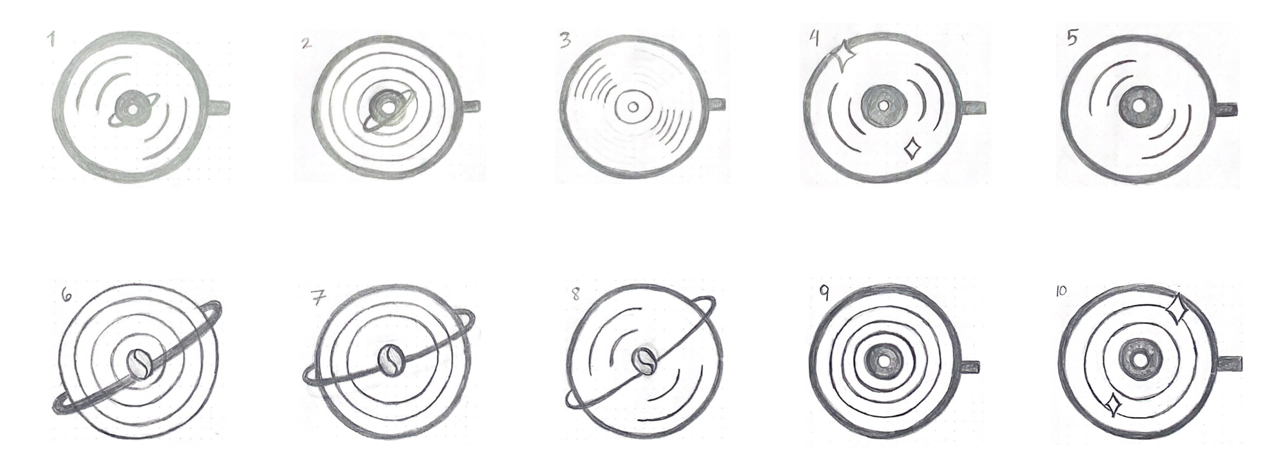
The challenge was to create a visual that balanced both the record store and cafe components while also maintaining the “Cosmic” aspect of the original identity. The process of logo design began with a series of 50 thumbnail sketches aimed at capturing ideas for the logo composition, content, and style.
From there, a collection of tight compositions were sketched, refining and further developing the initial ideas from the thumbnail stage. The three strongest compositions were then pulled into Adobe Illustrator for digital rendering, and a single logo was eventually selected, refined, and finalized.

Thumbnail Sketches
Tight Compositions

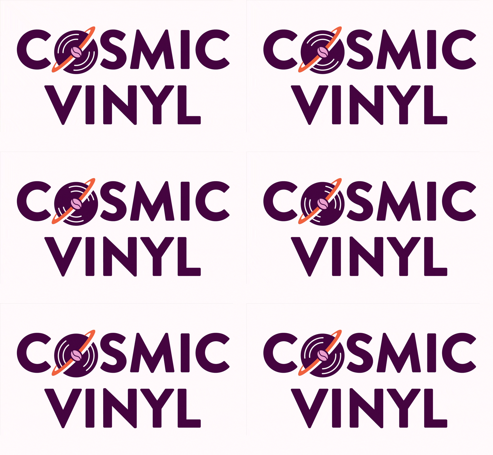
Initial Digital Compositions

Color Explorations
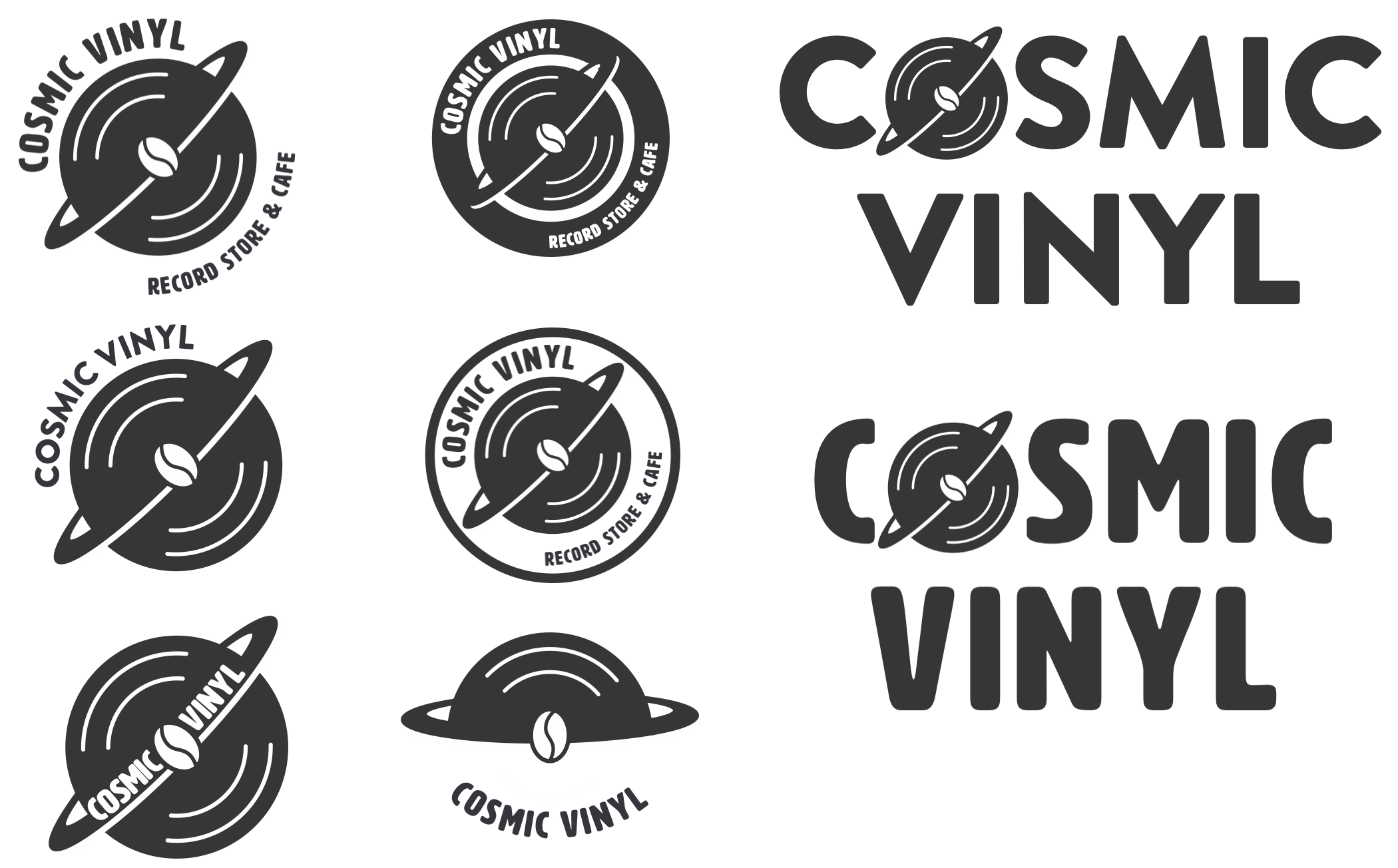
Lockup explorations: Though the font on the bottom was compelling due to its style reminiscent of traditional vinyls, the top selection proved to be a better selection to the robust nature (which mirrored the logomark's round structure nicely) and its bouncy and youthful appearance (qualities in-line with Cosmic Vinyl's brand and target audience).
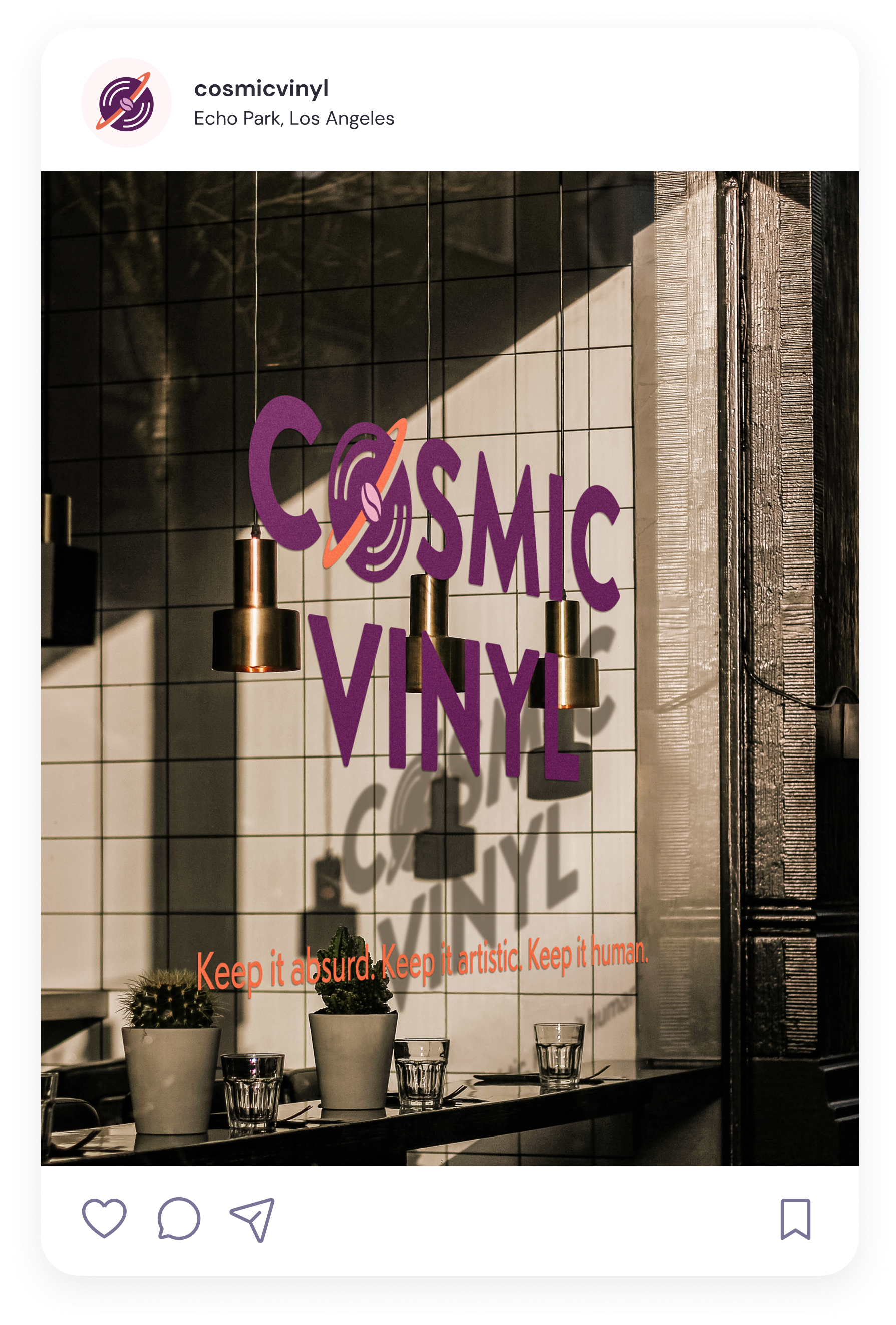
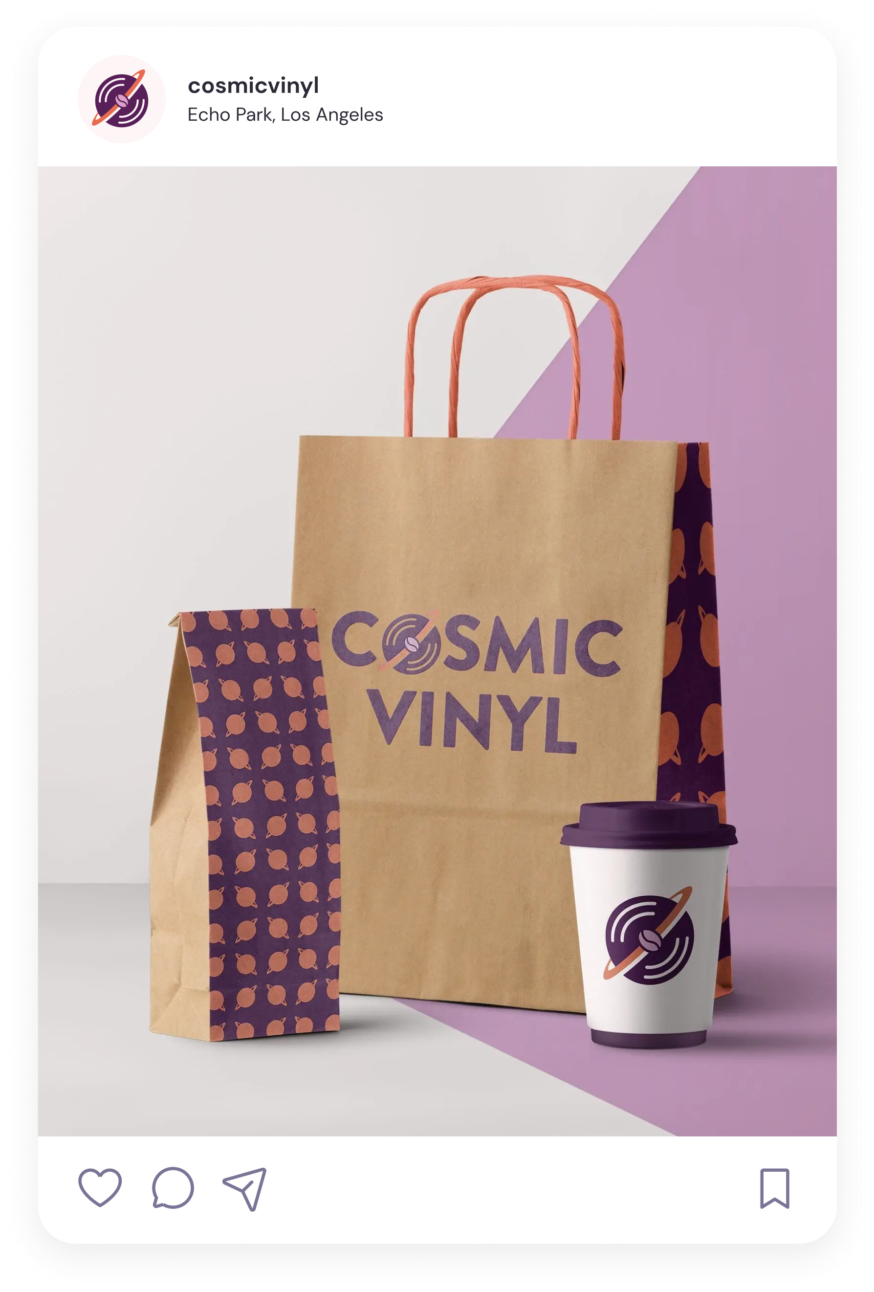
The Rebrand in Action

