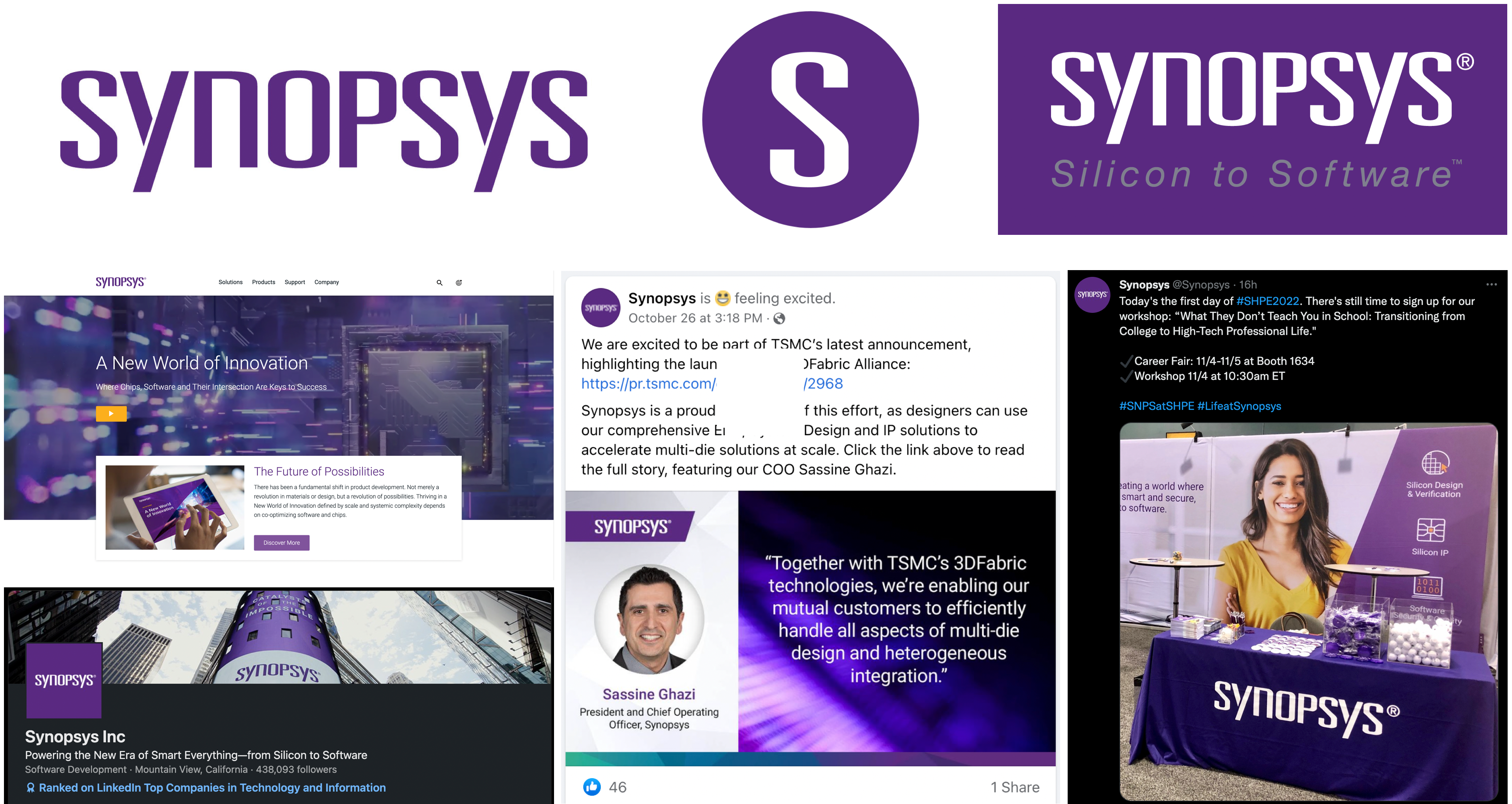
Synopsys
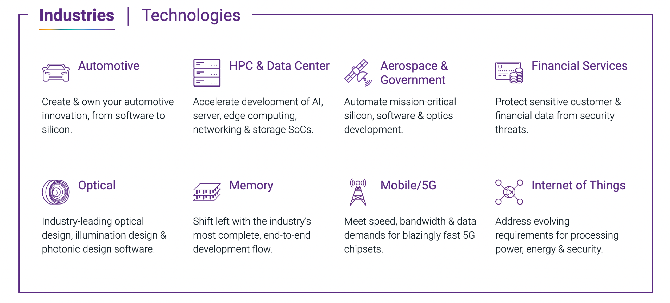
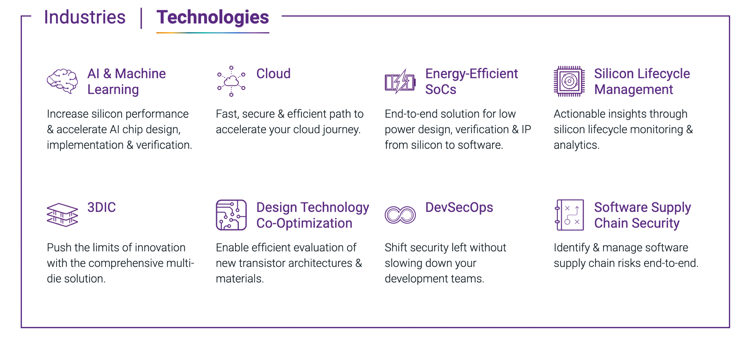
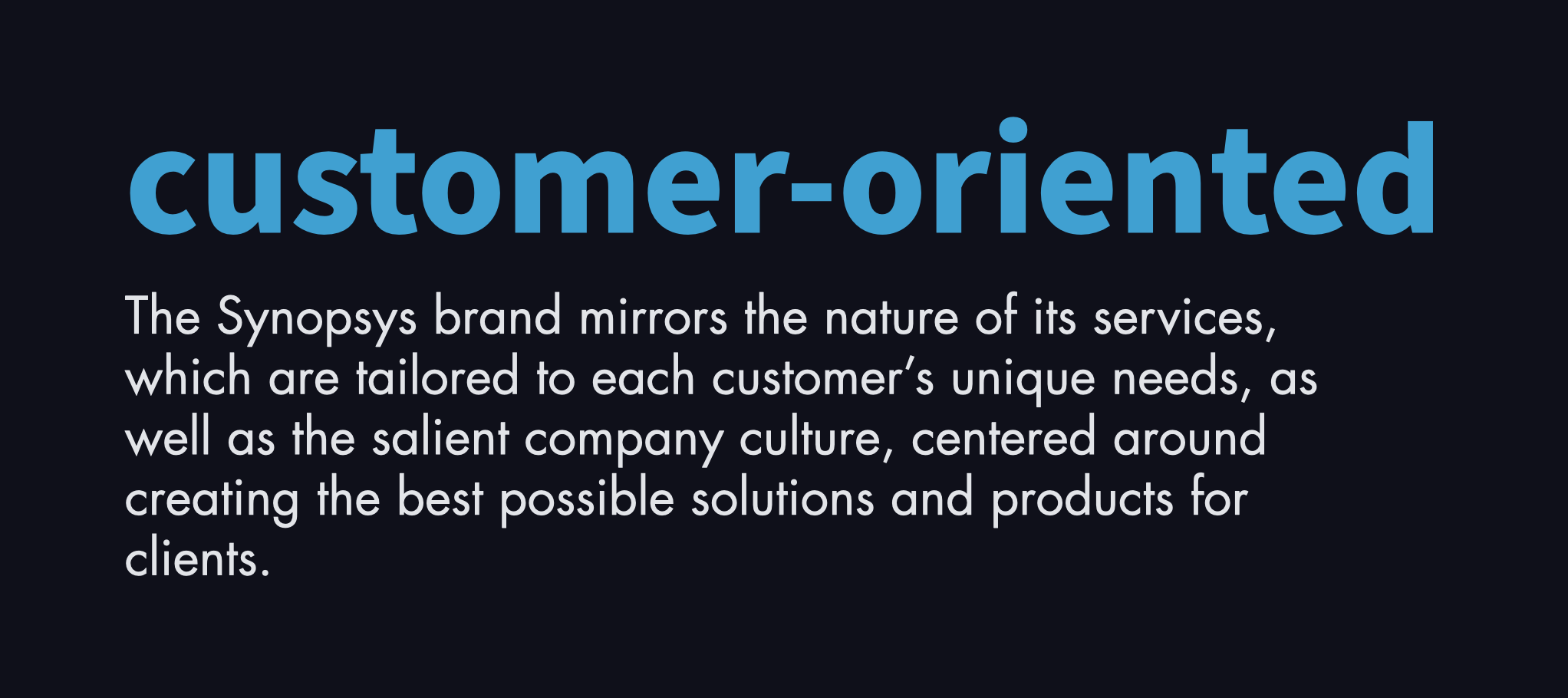
Synopsys is a leading provider of electronic design automation (EDA) software and services. Its portfolio comprises silicon IP (interface, foundation, and physical IP), silicon design and verification (EDA automation solutions and services), and application security.
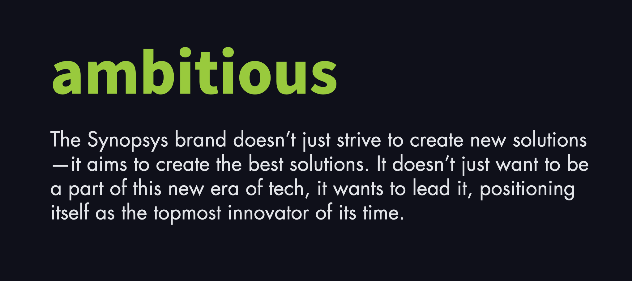
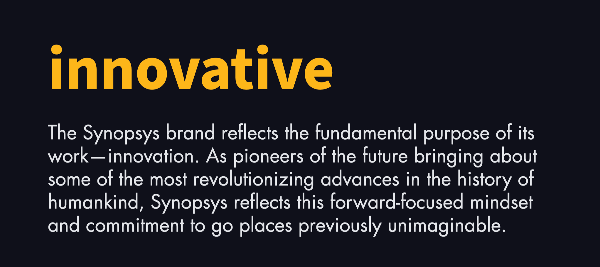
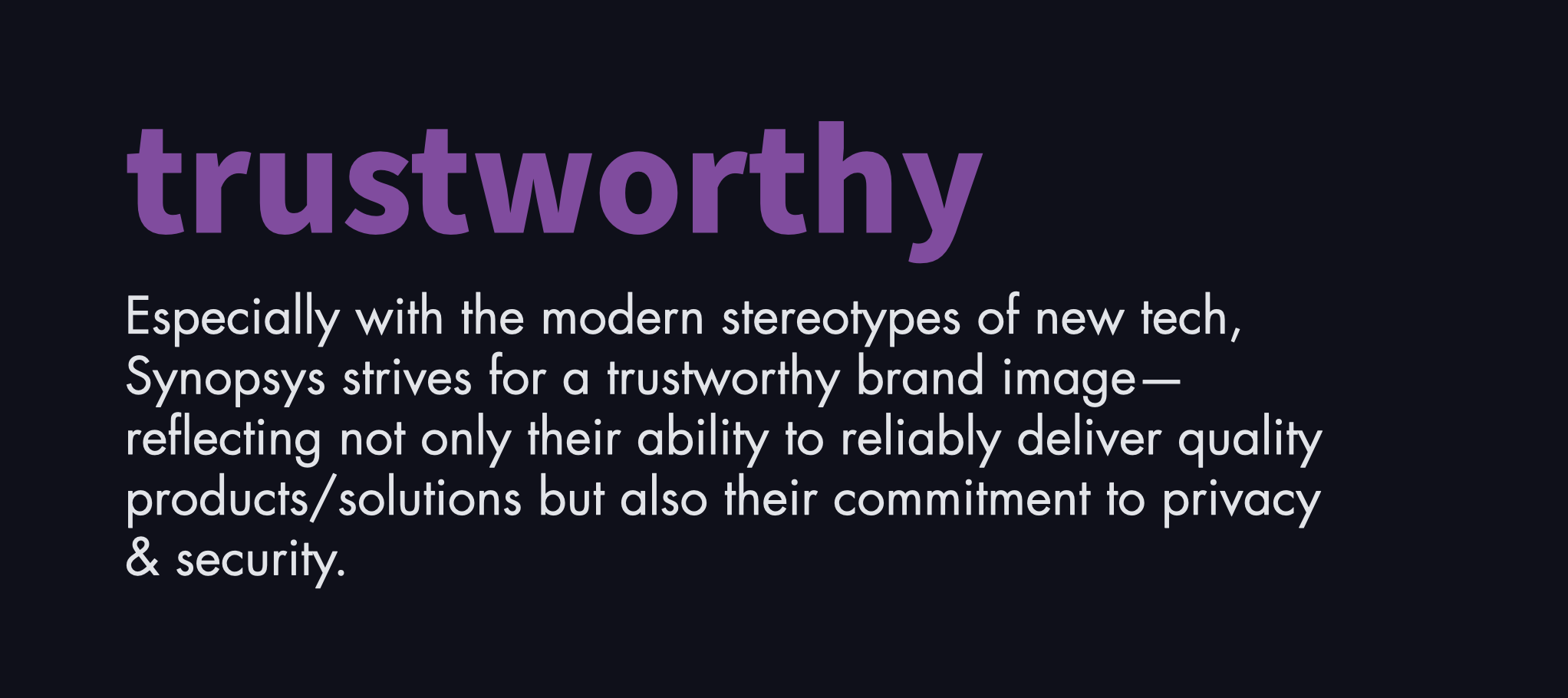
In this project, I propose a new brand identity for the tech giant, which pivots to reposition Synopsys as a leader of innovation, strengthen trust in the brand, and reestablish brand loyalty as purchasing power shifts to Gen-Z consumers.
Role
Designer
Project
Brand Identity
Logo Design
Type
Conceptual
Timeline
6 weeks


Assessing the market
Assessing the market
Understanding Synopsys' surrounding context
Understanding Synopsys' surrounding context
The first step in the rebranding process was a deep dive into the brand and EDA market, with the goal of contextualizing Synopsys and identifying areas for improvement. For a corporate brand like Synopsys, this task entailed defining the business model, researching the EDA market, and synthesizing findings into a SWOT analysis of the brand.

Defining Synopsys' business model

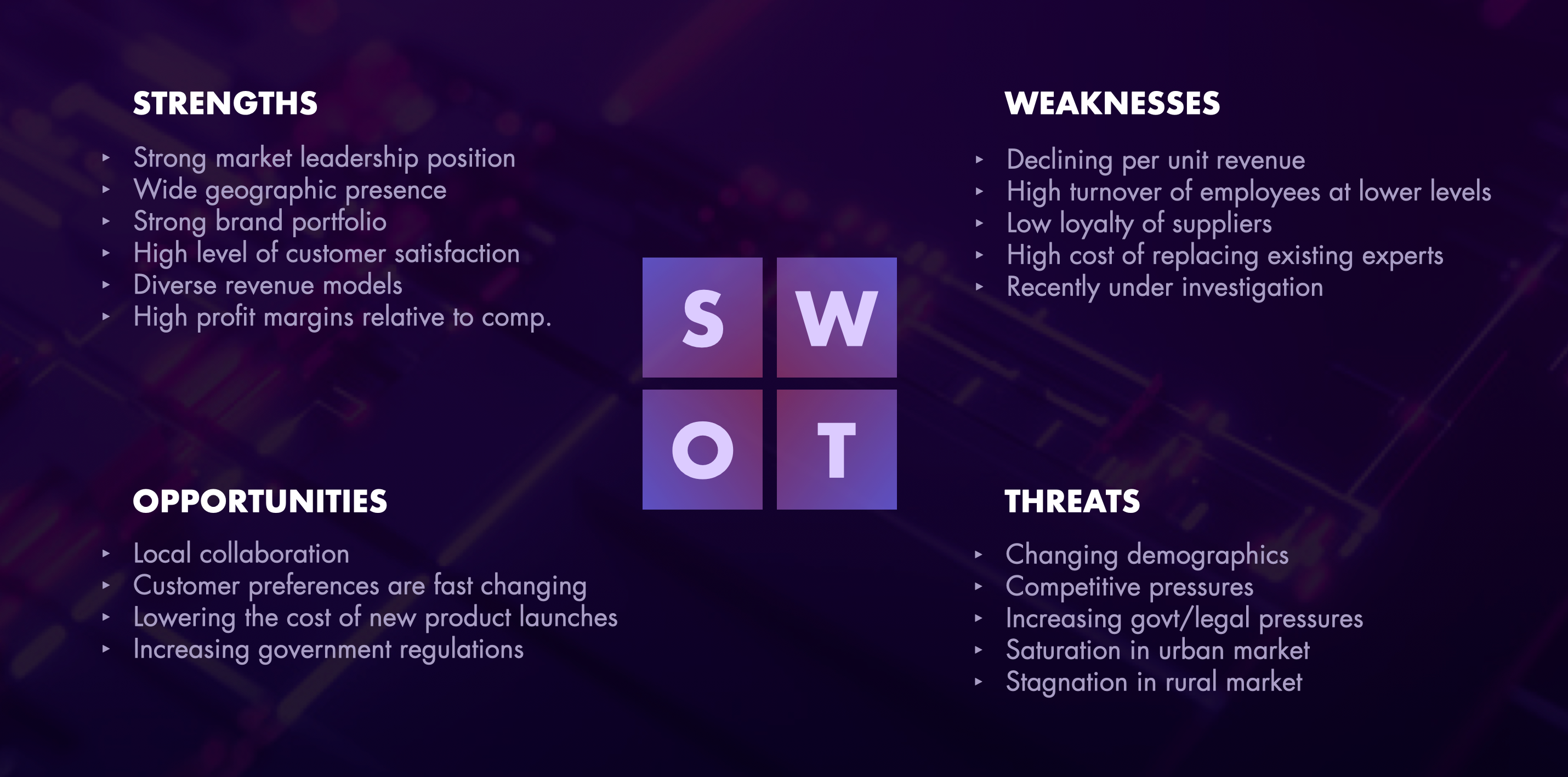
SWOT analysis of Synopsys
Evaluating the Brand
Evaluating the Brand
Brand evaluation
Brand evaluation
After gaining some insight into the context surrounding Synopsys, I conducted a series of audits of the brand itself to define Synopsys' position in the current architecture. This research involved defining the brand architecture and conducting both a brand and competitor audit.

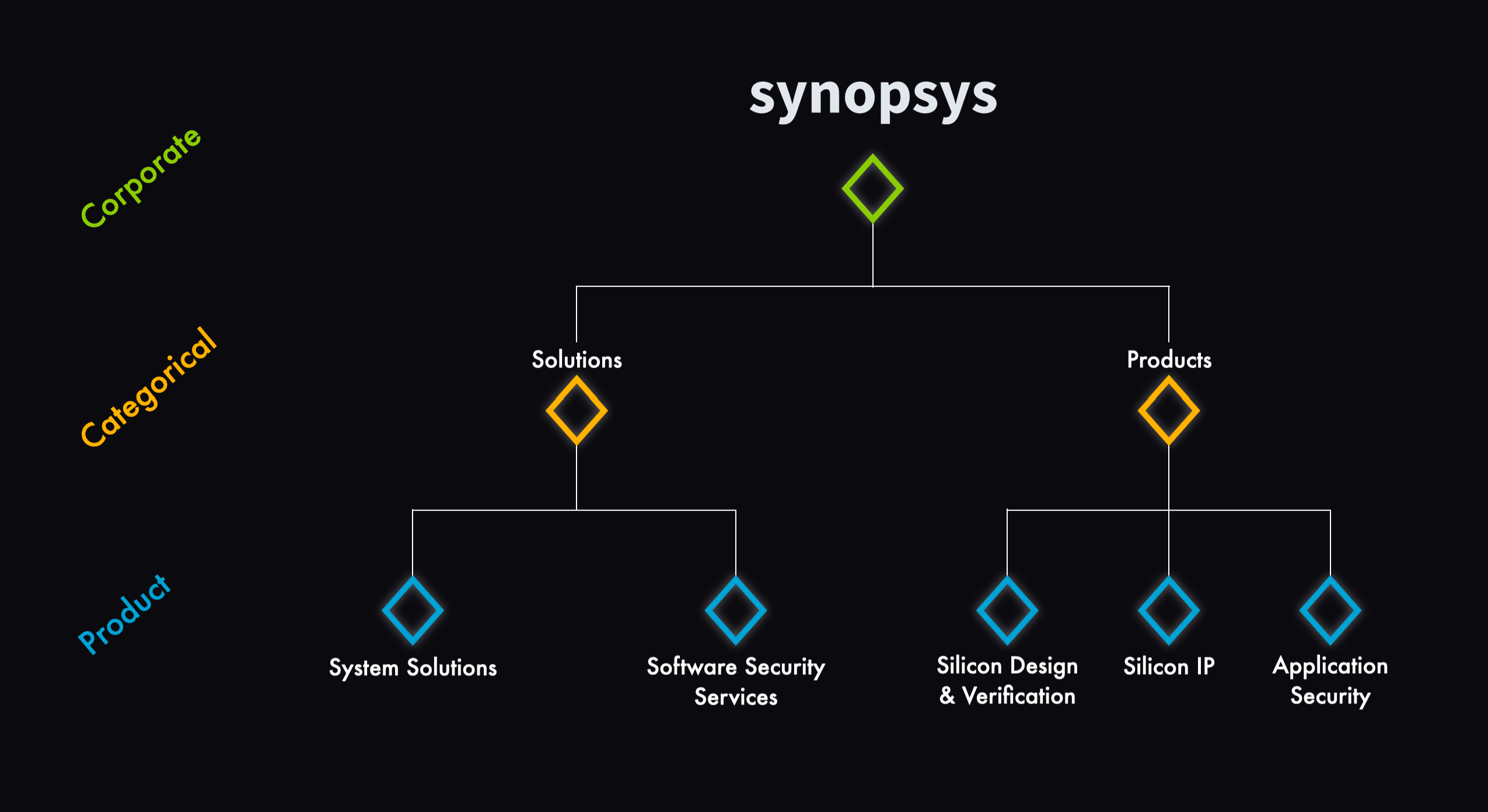
Brand architecture graphic

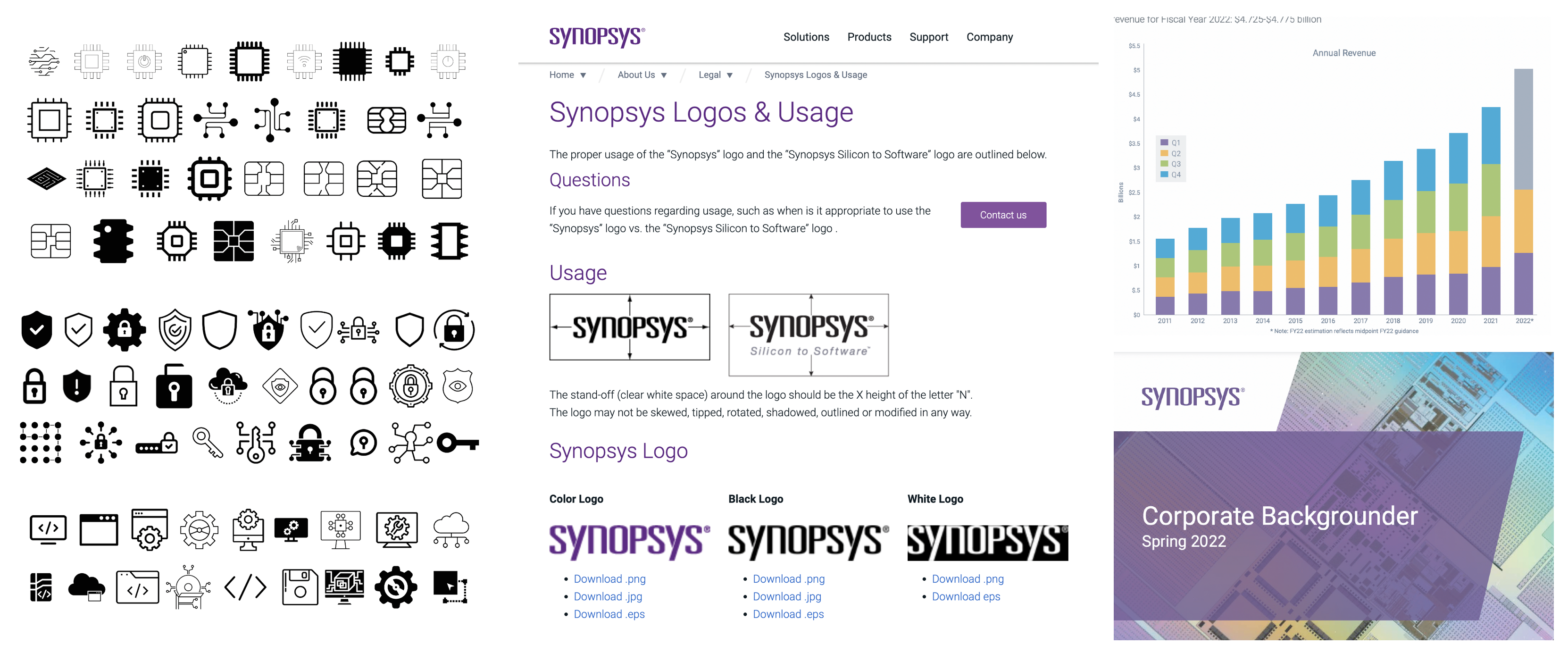
Brand audit

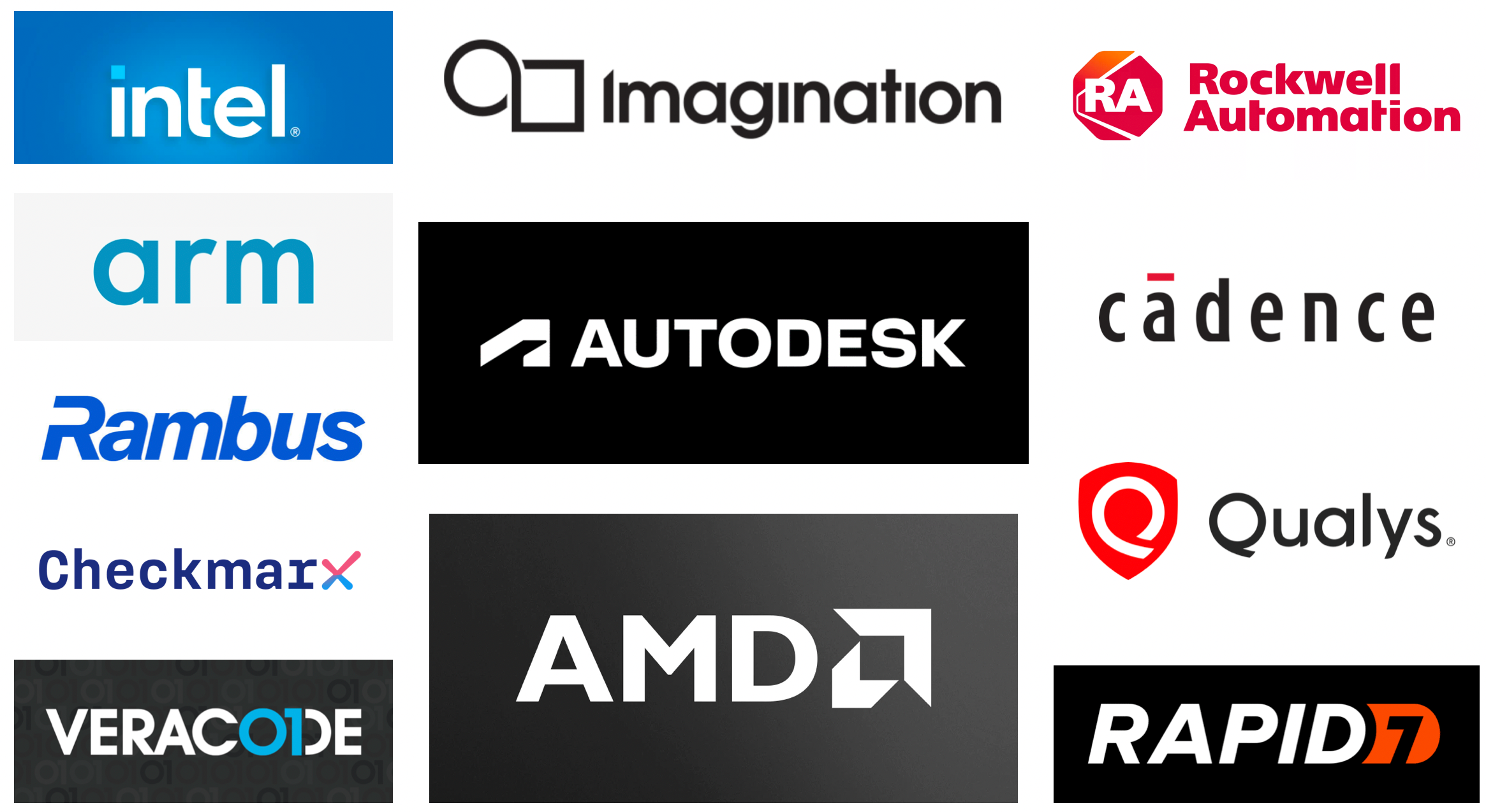
Competitor audit. Using the audit, the following key trends were identified within competitor brands:
- Color Schemes: (1) blue & white, (2) black & white, (3) orange/red, black, & white
- Typography: primarily chunky, sans serif fonts; “tech” or futuristic feel
- Logo Composition: all wordmarks or combination marks
- Logo Shape/Outline: rectangular / modular feeling
- Logomarks: all very minimal and/or abstract; some shields, basic shapes, numbers
ReDefining the brand
ReDefining the brand
I researched how people saw Synopsys at the time of the rebrand...
I researched how people saw Synopsys at the time of the rebrand...
Using a variety of sources online (employee reviewing sites, Google reviews, workplace Q&A sites, etc), I created a list of internal and external brand perceptions. These insights played a key role in identifying key pain points & weighing the brand equity at stake (and thus what could and could not be changed in the rebrand).

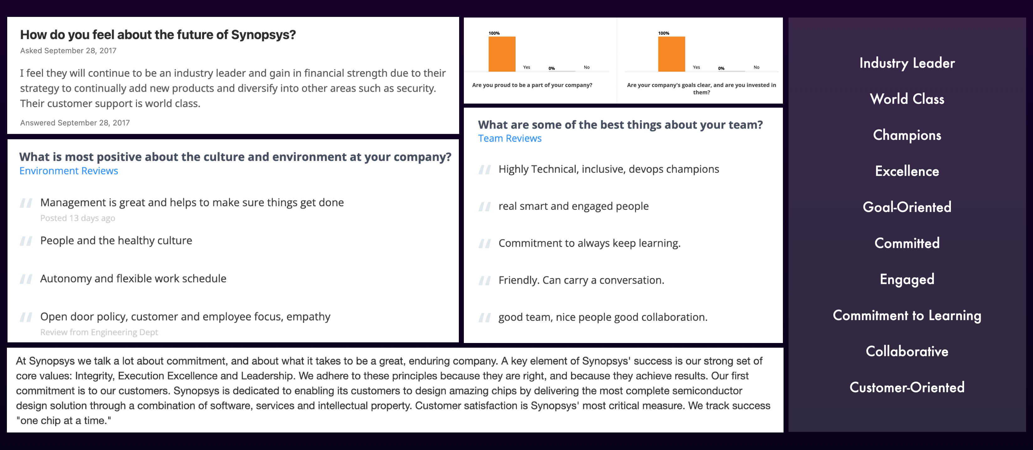

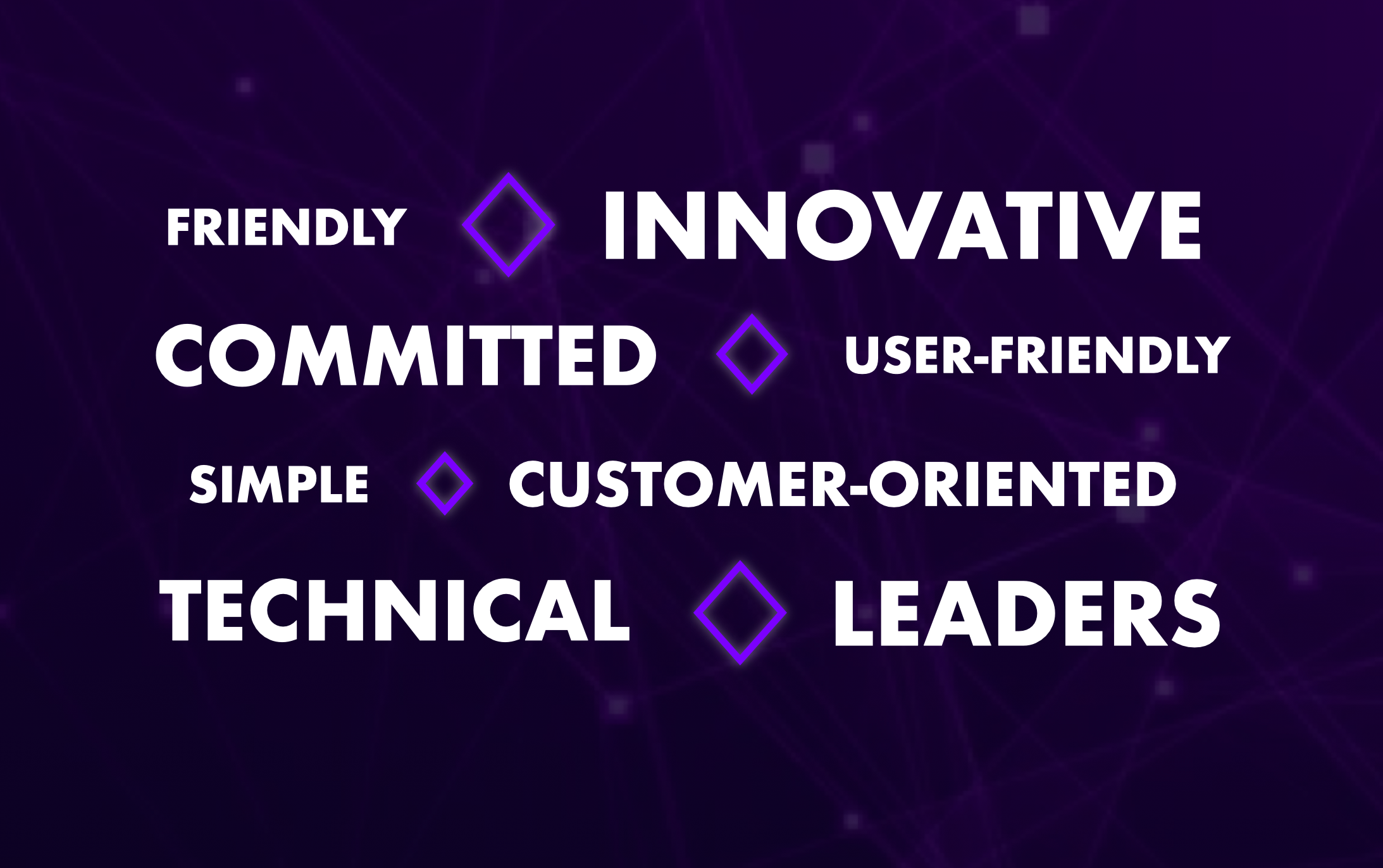
Assessment of internal (left) and external (right) brand perception
problem
problem
Defined 3 rebrand objectives based on the market audit and brand perception research...
Defined 3 rebrand objectives based on the market audit and brand perception research...


Maintain brand equity (and customer loyalty/trust)

Distinguish Synopsys visually from competitors

Rebrand to create desired brand perceptions
problem
problem
And identified 4 key brand drivers.
And identified 4 key brand drivers.
Maintain brand equity (and customer loyalty/trust)
Distinguish Synopsys visually from competitors
Rebrand to create desired brand perceptions

Brand Audit: Environmental (left) and Digital (right)
Reimagining the brand part I: visual identity
Reimagining the brand part I: visual identity
Updating Synopsys' look while maintaining brand equity
Updating Synopsys' look while maintaining brand equity
The identity reintroduces Synopsys as an innovator rather than a tech company, moving the branding away from traditional "old tech" associations (outdated, untrustworthy, cryptic) towards ideas of progress and innovation, to better connect to the changing market.

Visual Research. I looked into various symbols online to better understand the visual language of tech-oriented products/services. Additionally, I conducted an audit of Synopsys' internal documents, searching for themes, motifs, and/or colors that could be used in the rebrand, so as not to completely change the company image and isolate existing customers.

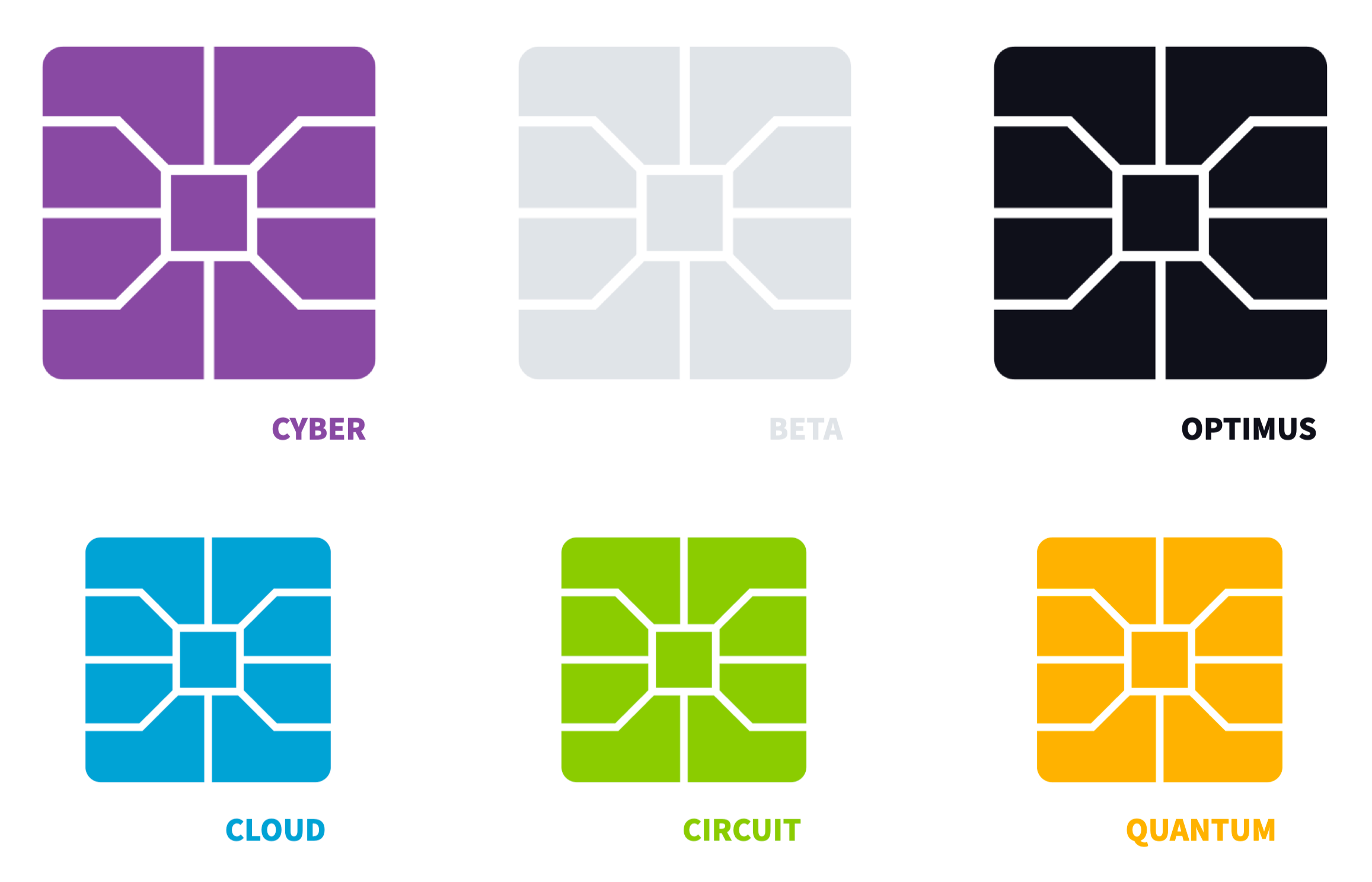
The new identity introduces an expanded color palette that retains the brand’s original violet while providing secondary colors that modernize the brand and allow for more diverse and engaging applications. The new visual identity preserves brand equity by maintaining key brand associations (for example, violet remains the primary brand color) and pulling inspiration for the redesigned elements from existing brand materials (for example, secondary colors were sampled from the Synopsys Spring 2022 Corporate Backgrounder).

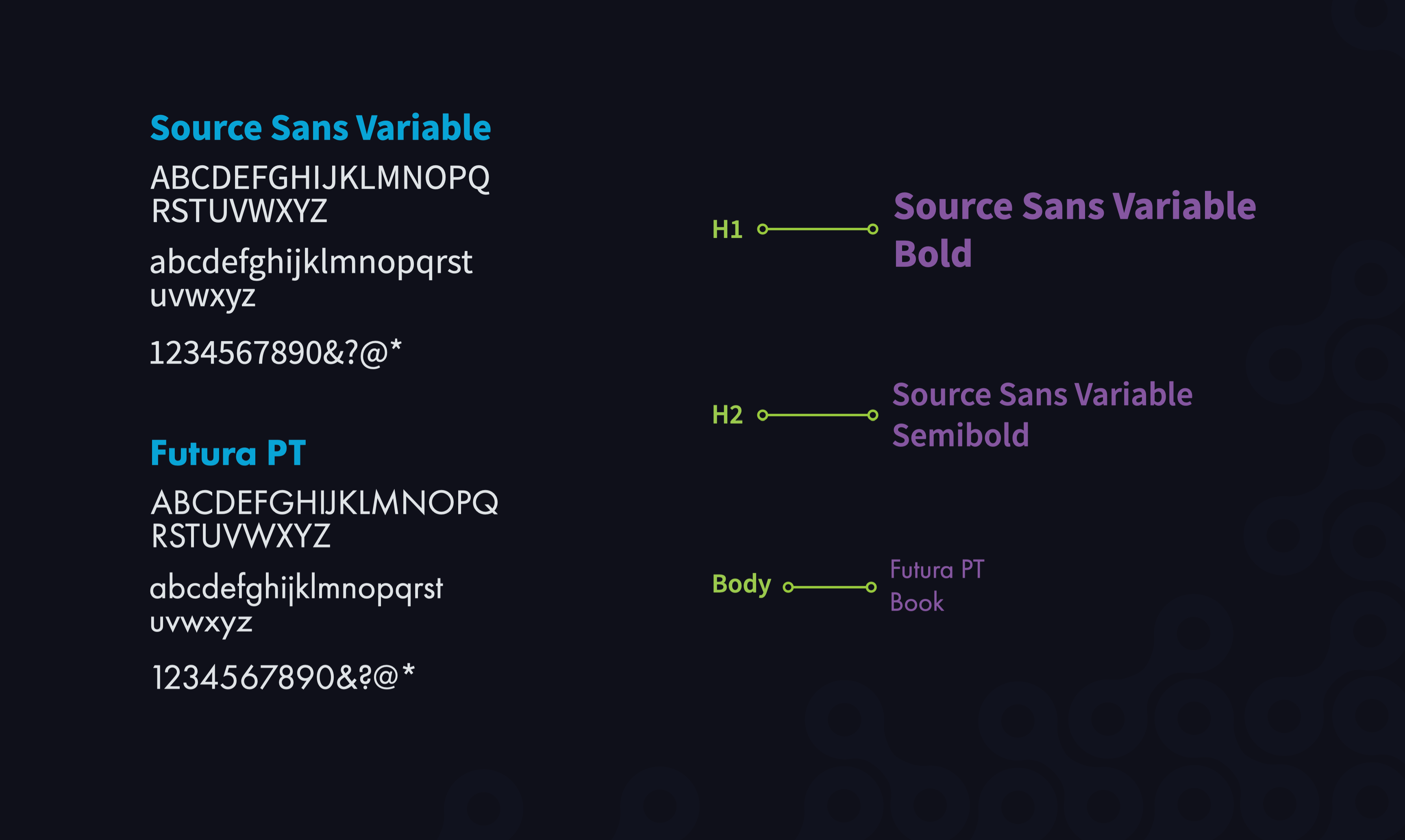
The new brand typography is minimalistic and sharp, modernizing the brand and achieving a clean technologic feel while avoiding any isolating, overly-techy /cryptic associations.
Reimagining the brand Part II: Logo
Reimagining the brand Part II: Logo
The Logo: From Paper to Screen.
The Logo: From Paper to Screen.
The process of logo design began with a series of 50 thumbnail sketches aimed at capturing ideas for the logo composition, content, and style. From there, a collection of tight compositions were sketched, refining and further developing the initial ideas from the thumbnail stage. The three strongest compositions were then pulled into Adobe Illustrator for digital rendering, and a single logo was eventually selected, refined, and finalized.

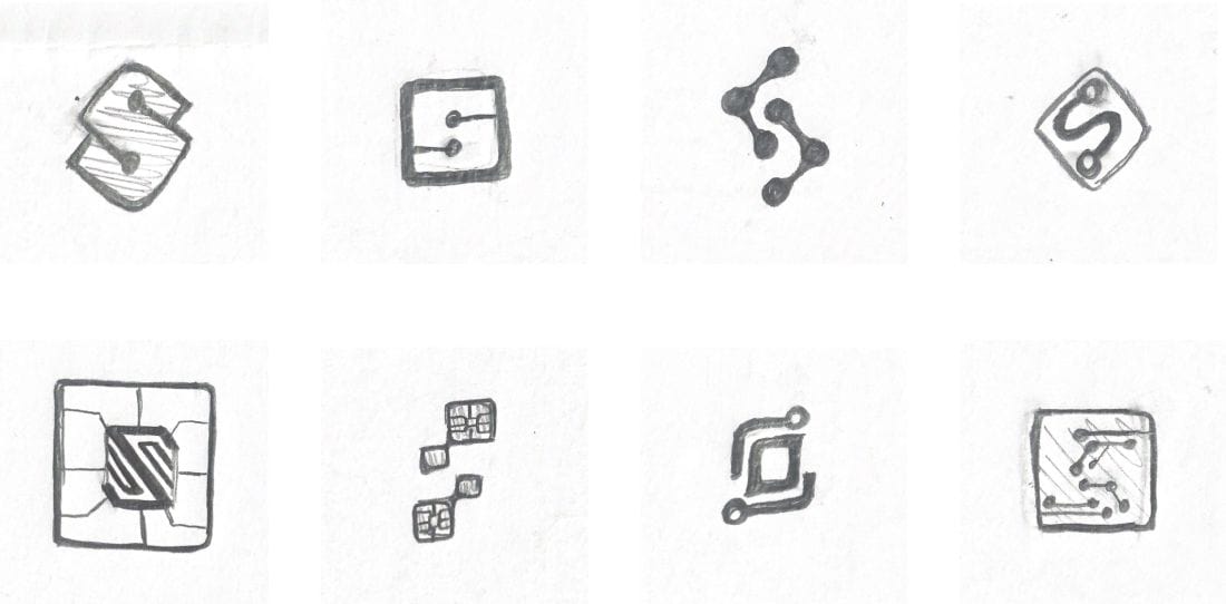
Tight Compositions

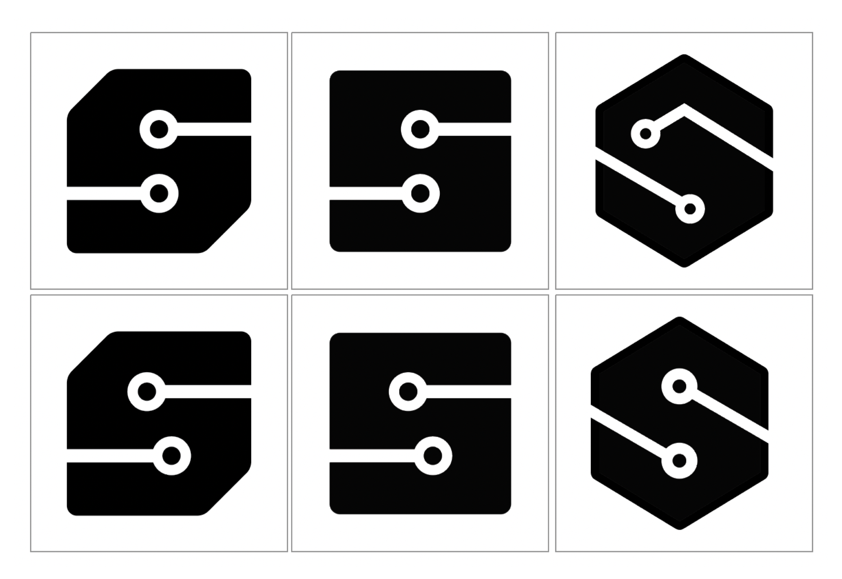
Initial Digital Compositions

Refined Digital Compositions (Combining two ideas)

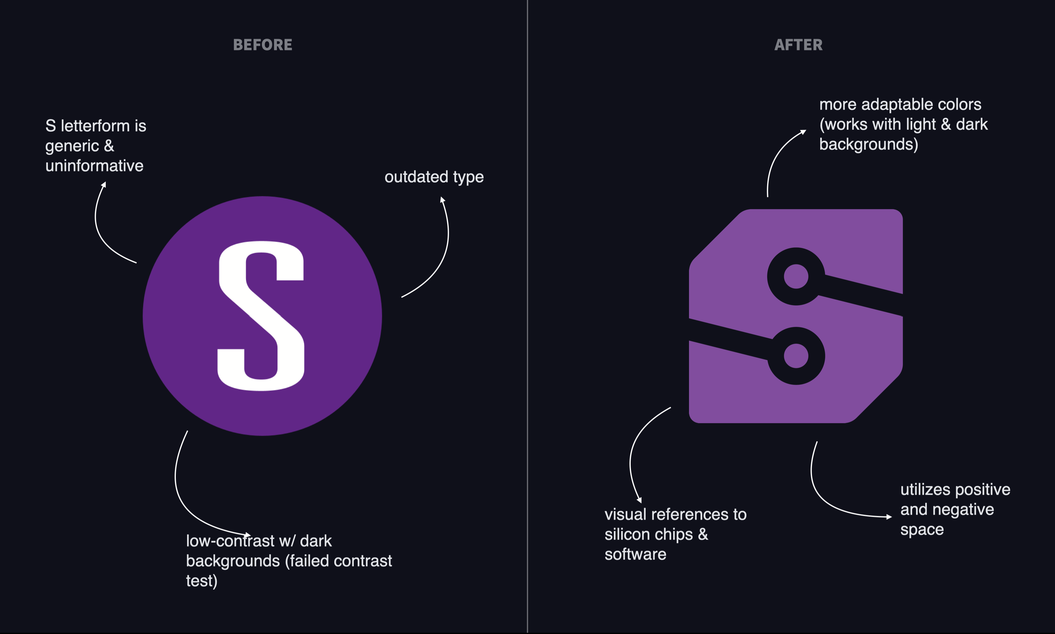

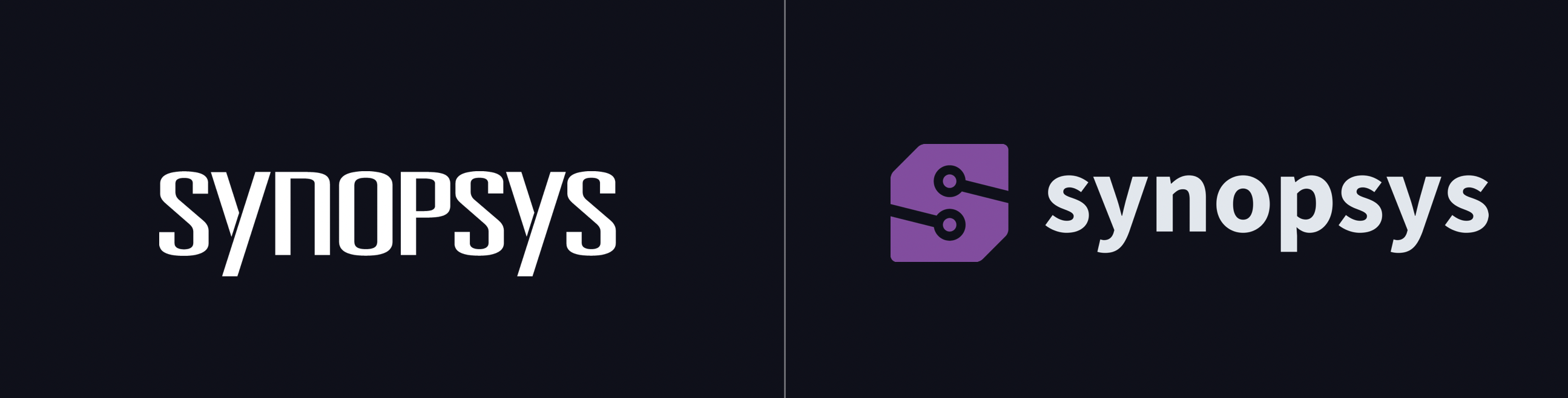
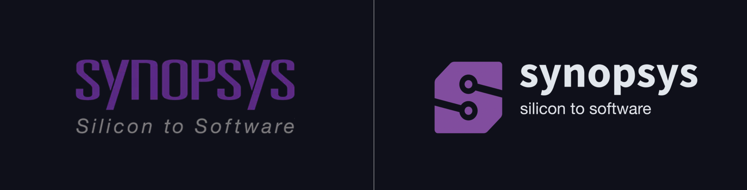
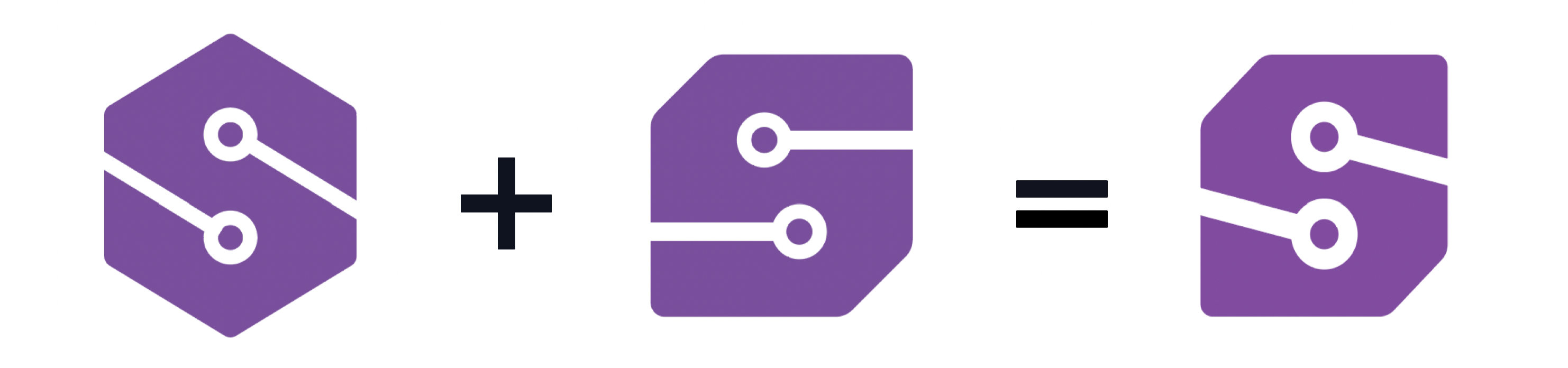
Before & Afters of the Logomark & Wordmark

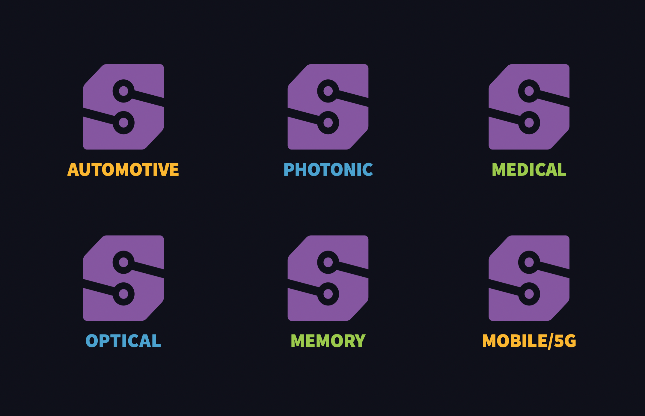
The resulting logomark redesign allows for custom applications across a variety of Synopsys divisions.

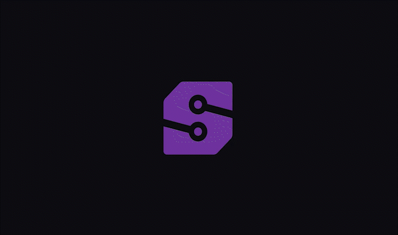
Logomark animation showcasing the brand's 3 key domains: silicon IP, silicon design and verification, and application security.
Applying the Brand
Applying the Brand
The rebrand in action: corporate applications
The rebrand in action: corporate applications
The identity reimagines Cosmic Vinyl’s logo to work consistently in different scales and contexts, showcase the unique hybrid store model, and convey a more accurate brand personality. The challenge was to create a visual that balanced both the record store and cafe components while also maintaining the “Cosmic” aspect of the original identity.

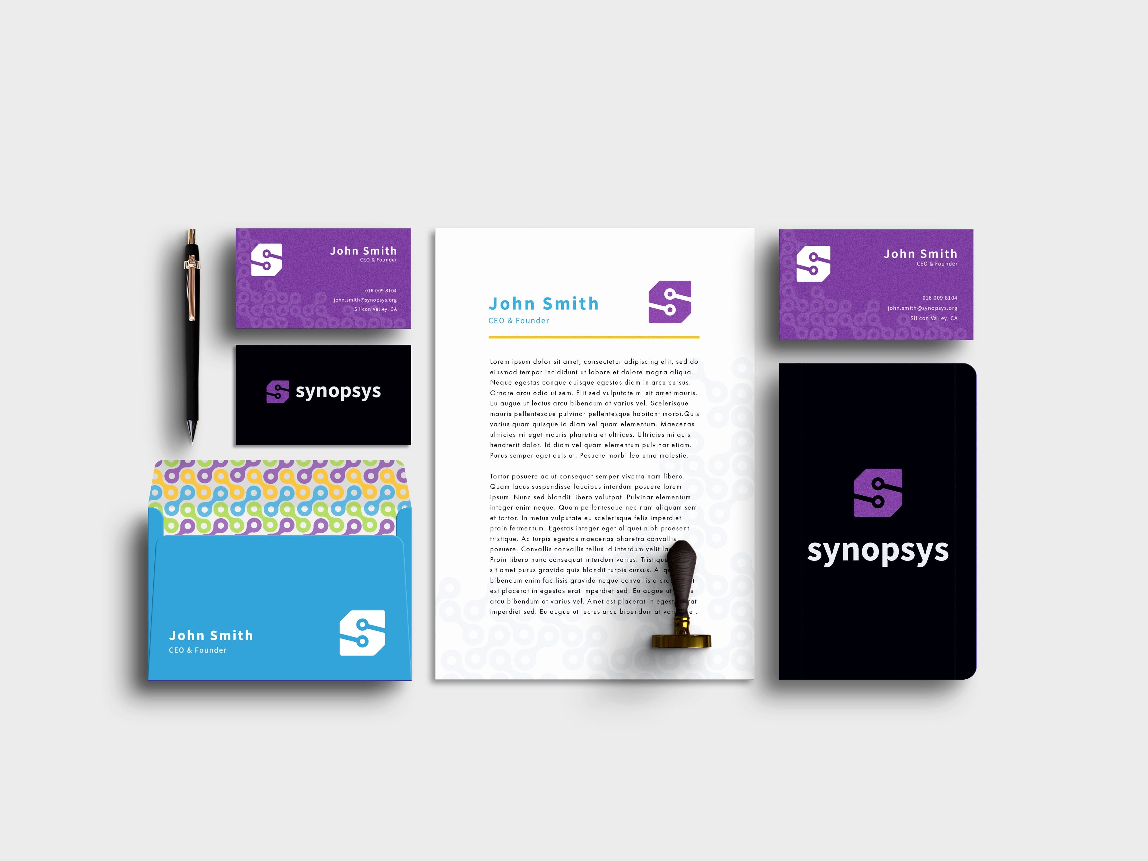
Design implementation on company stationary set

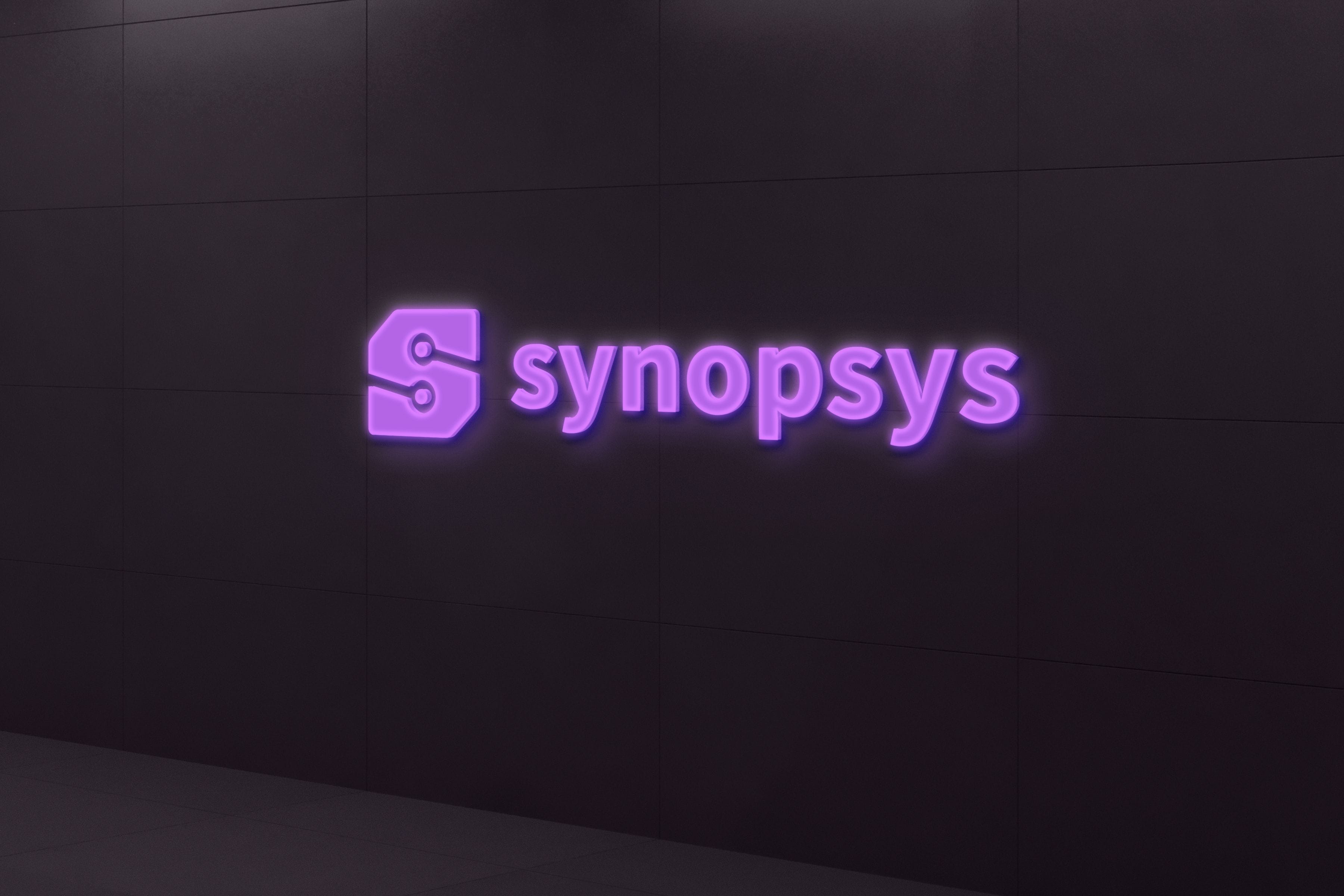
Environmental design (office signage)

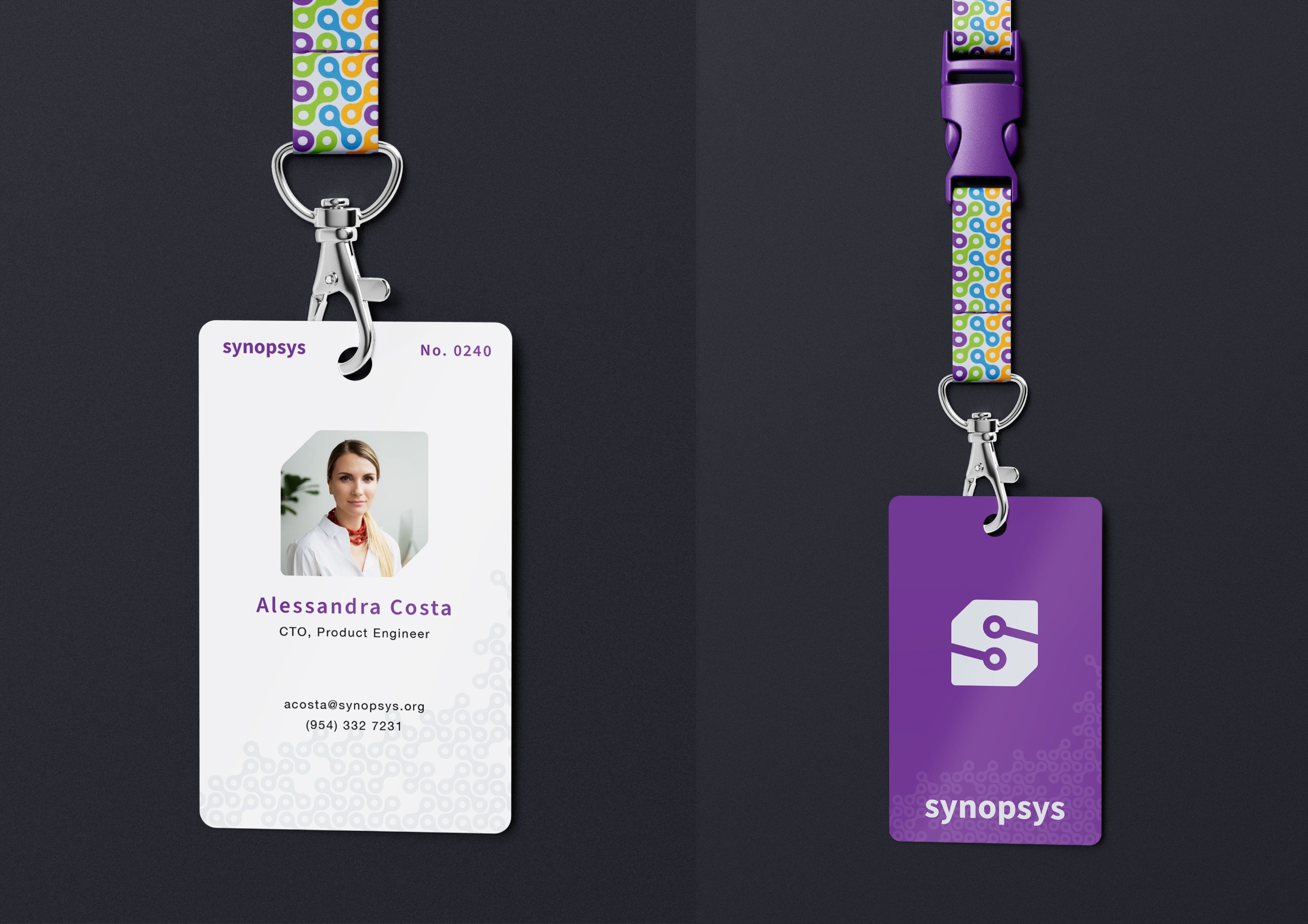
Design implementation on company lanyards

Motion design for the new logomark