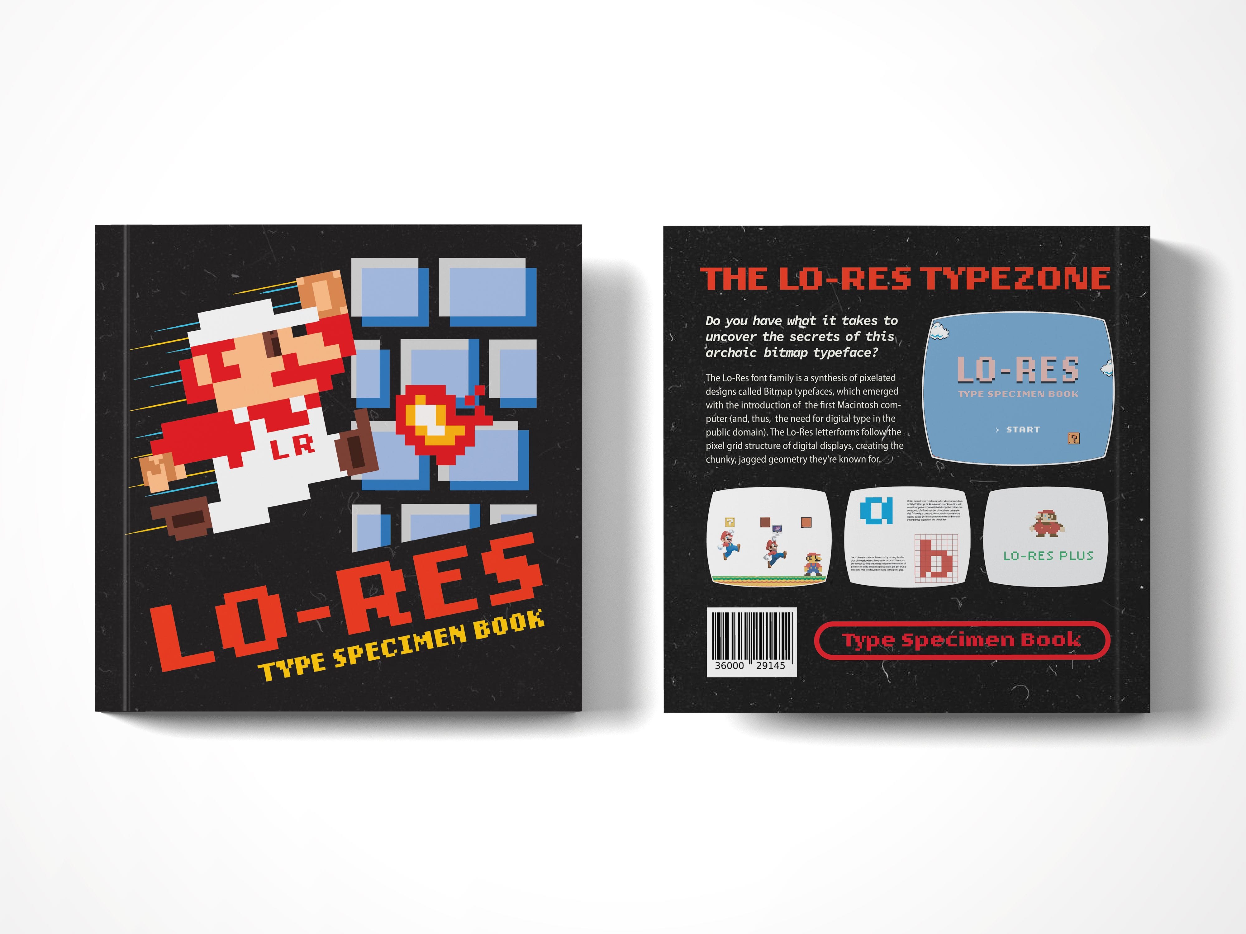
Lo-Res Type Specimen
Do you have what it takes to uncover the secrets of this archaic bitmap typeface?
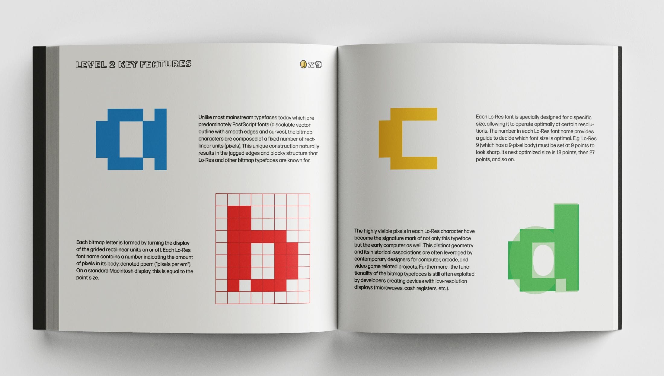
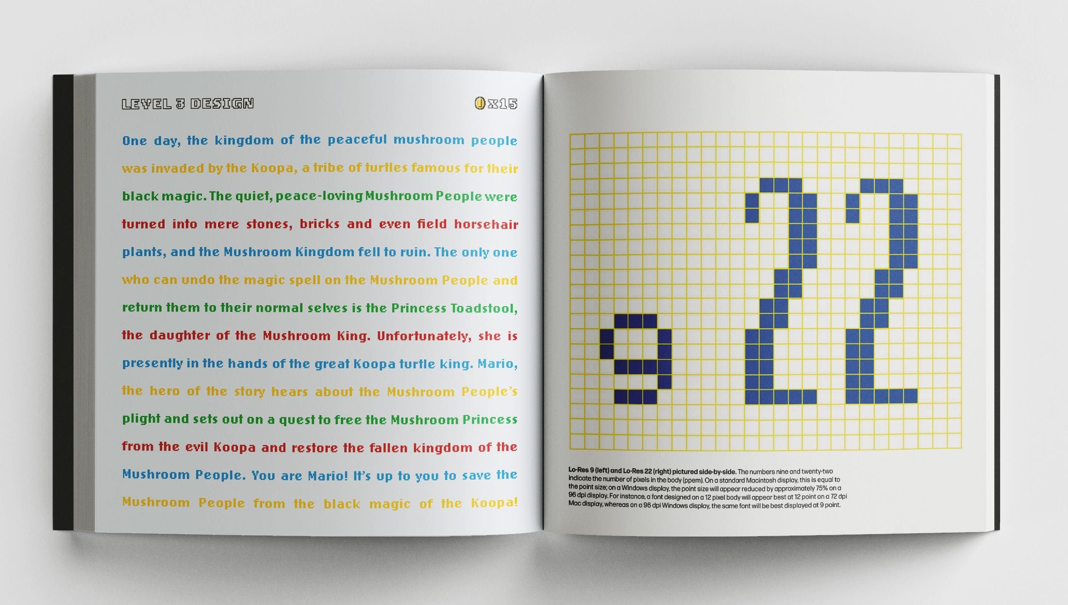
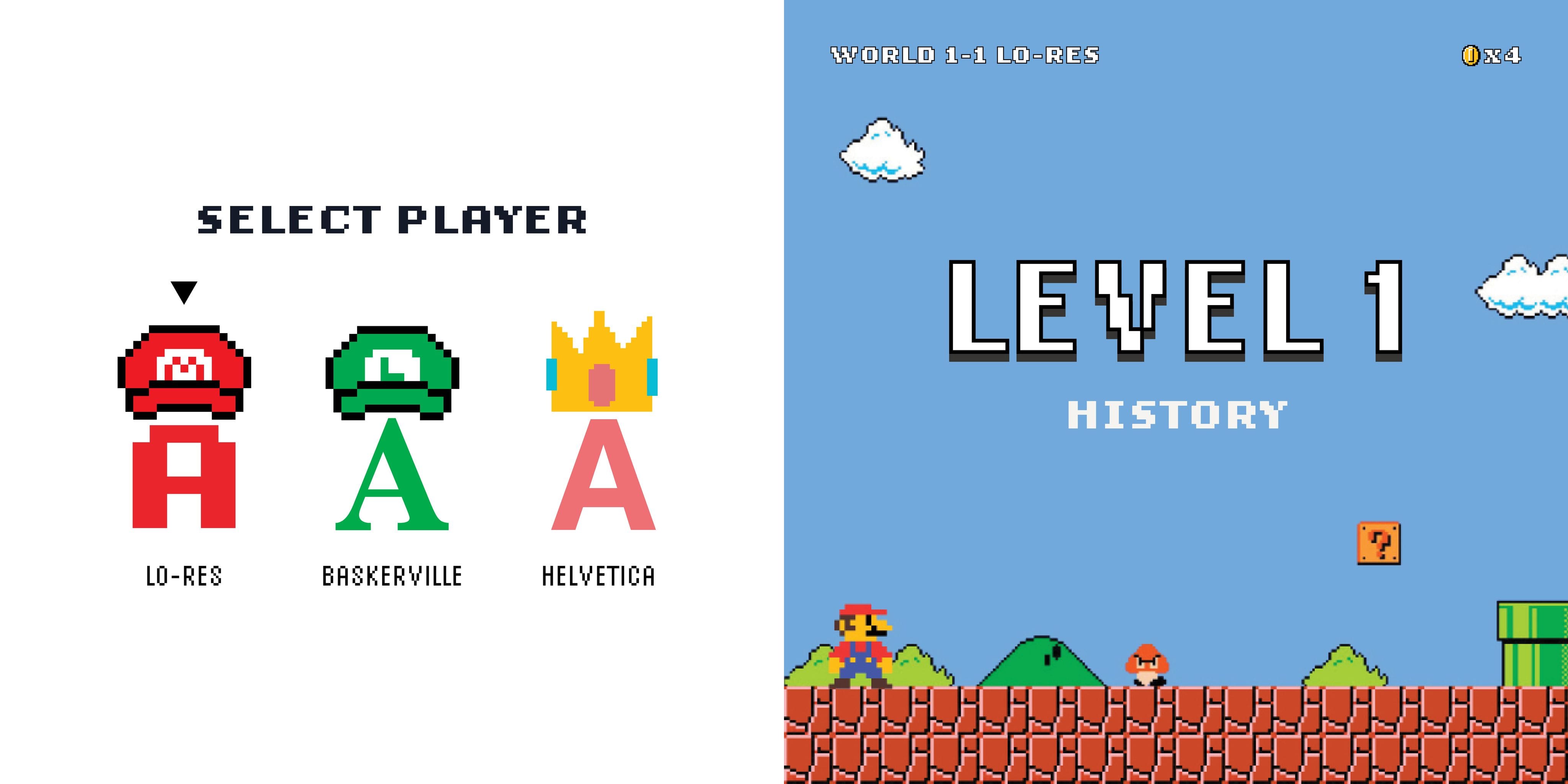
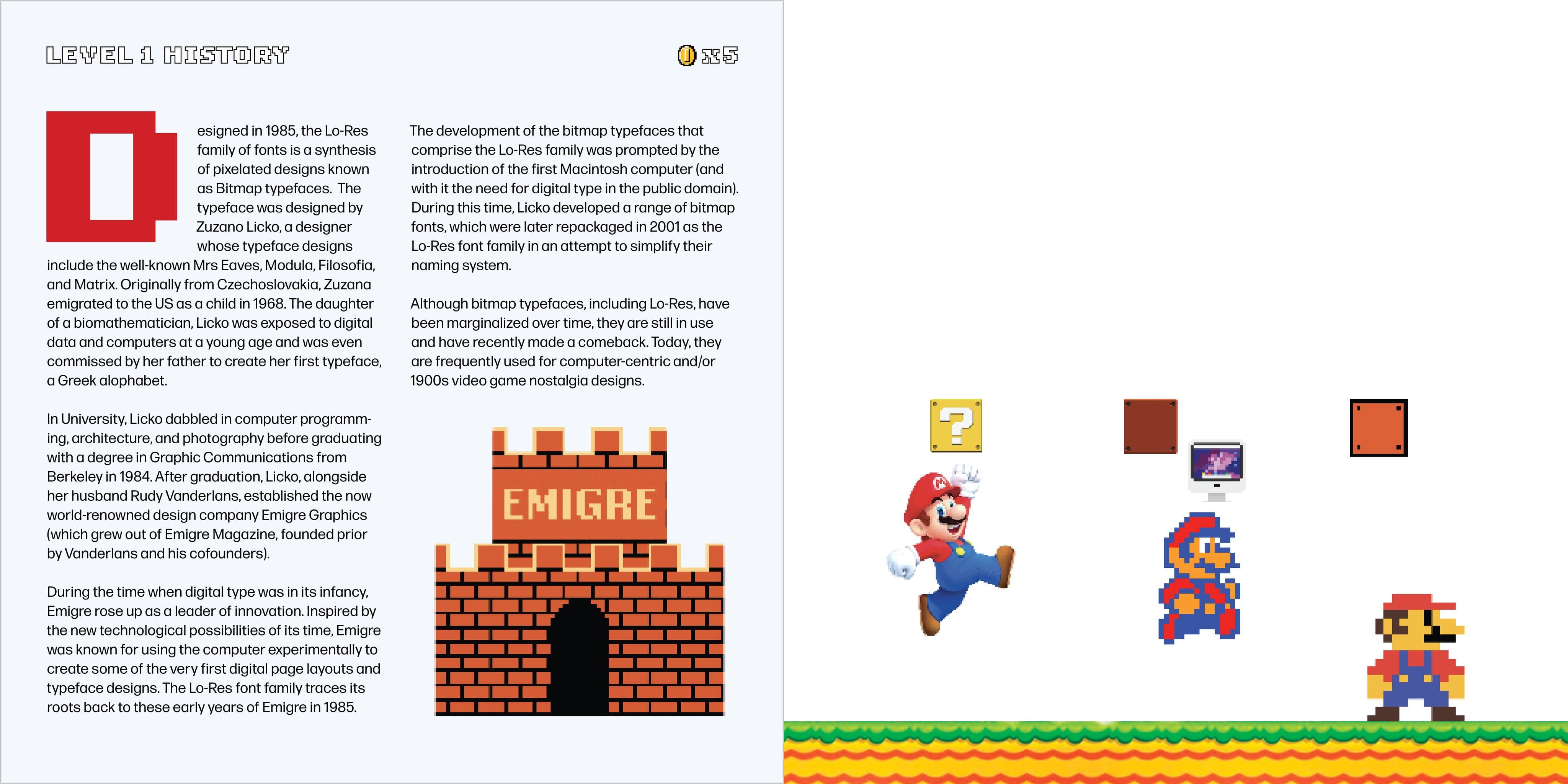
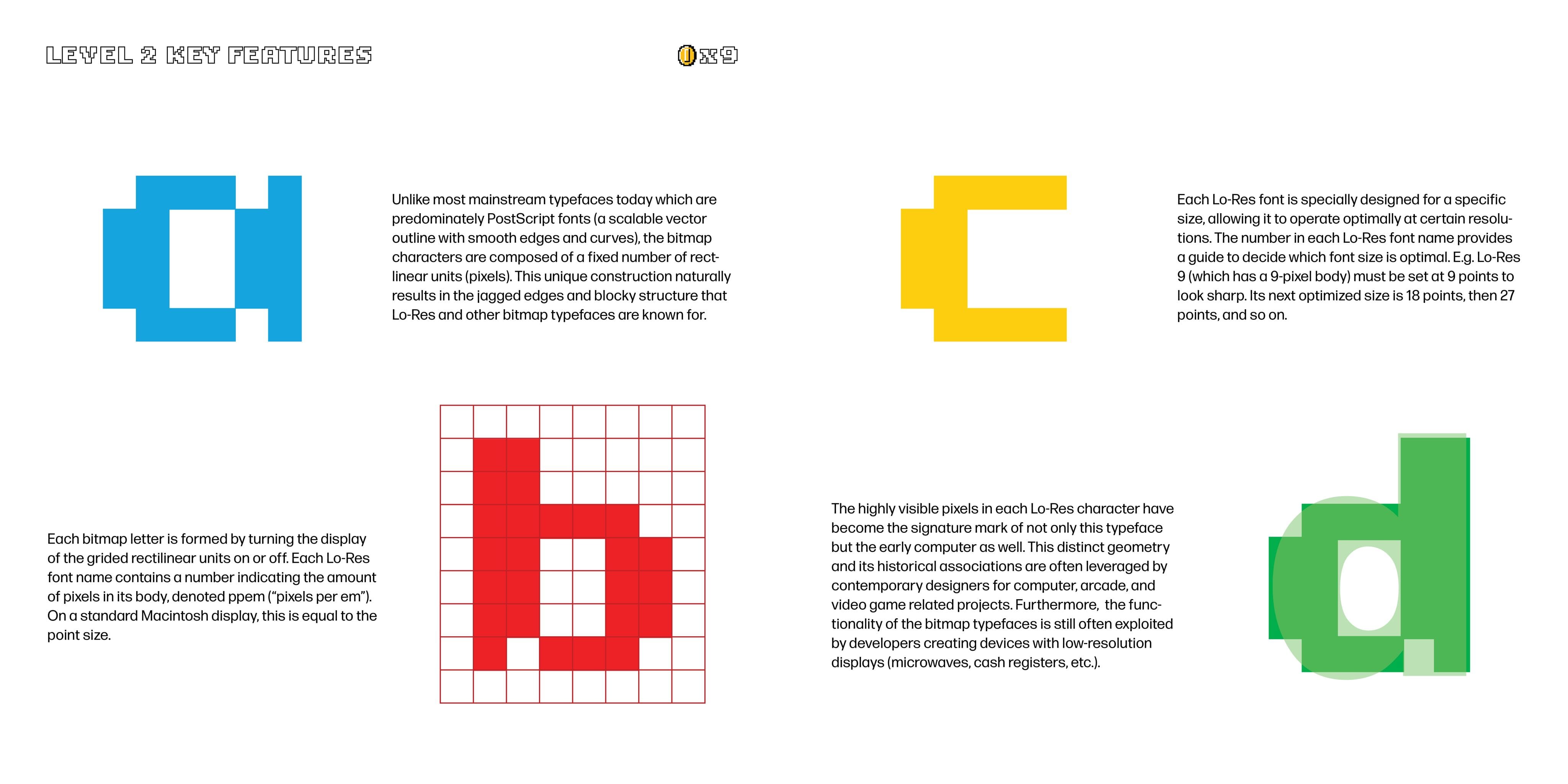
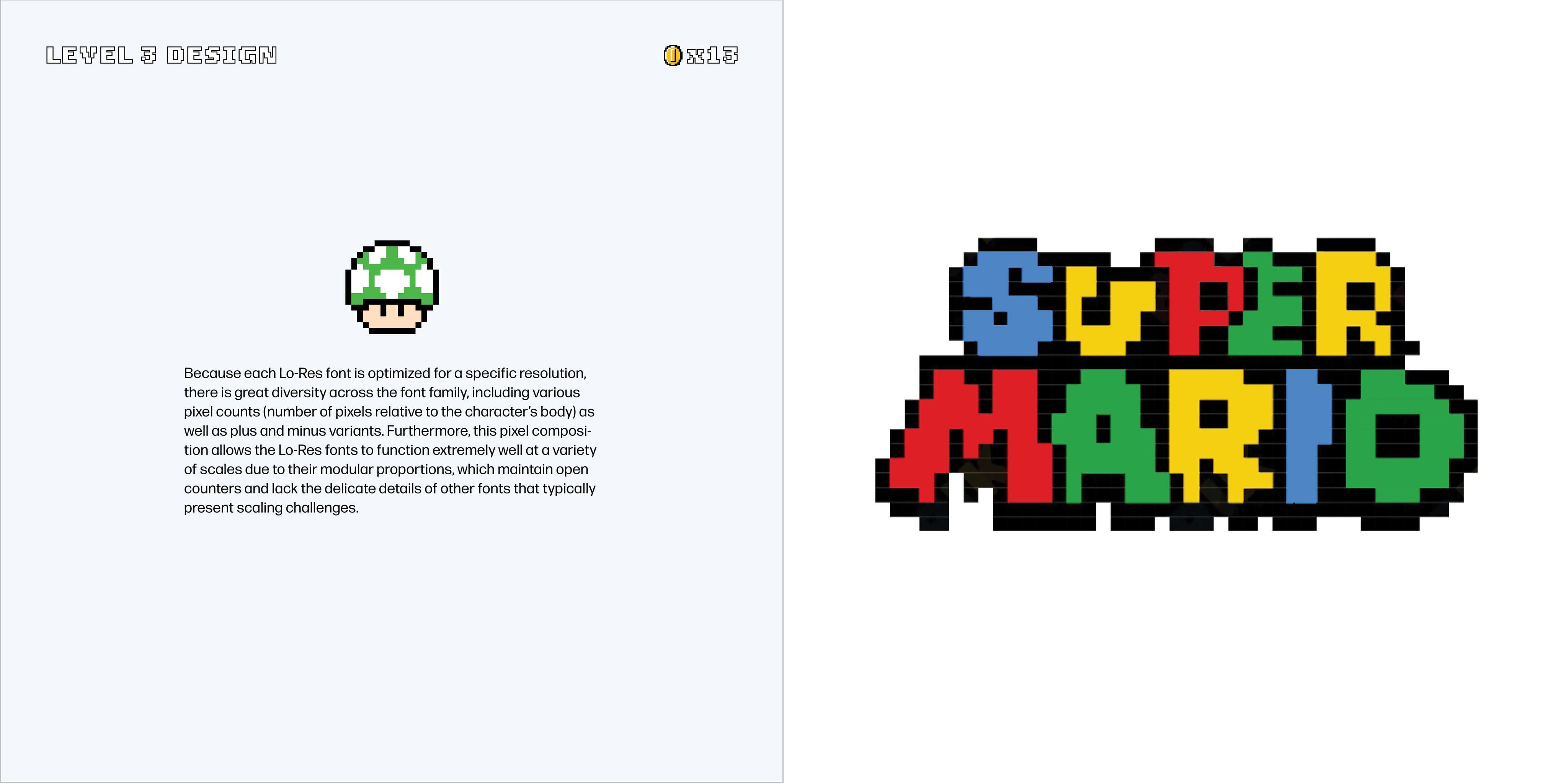
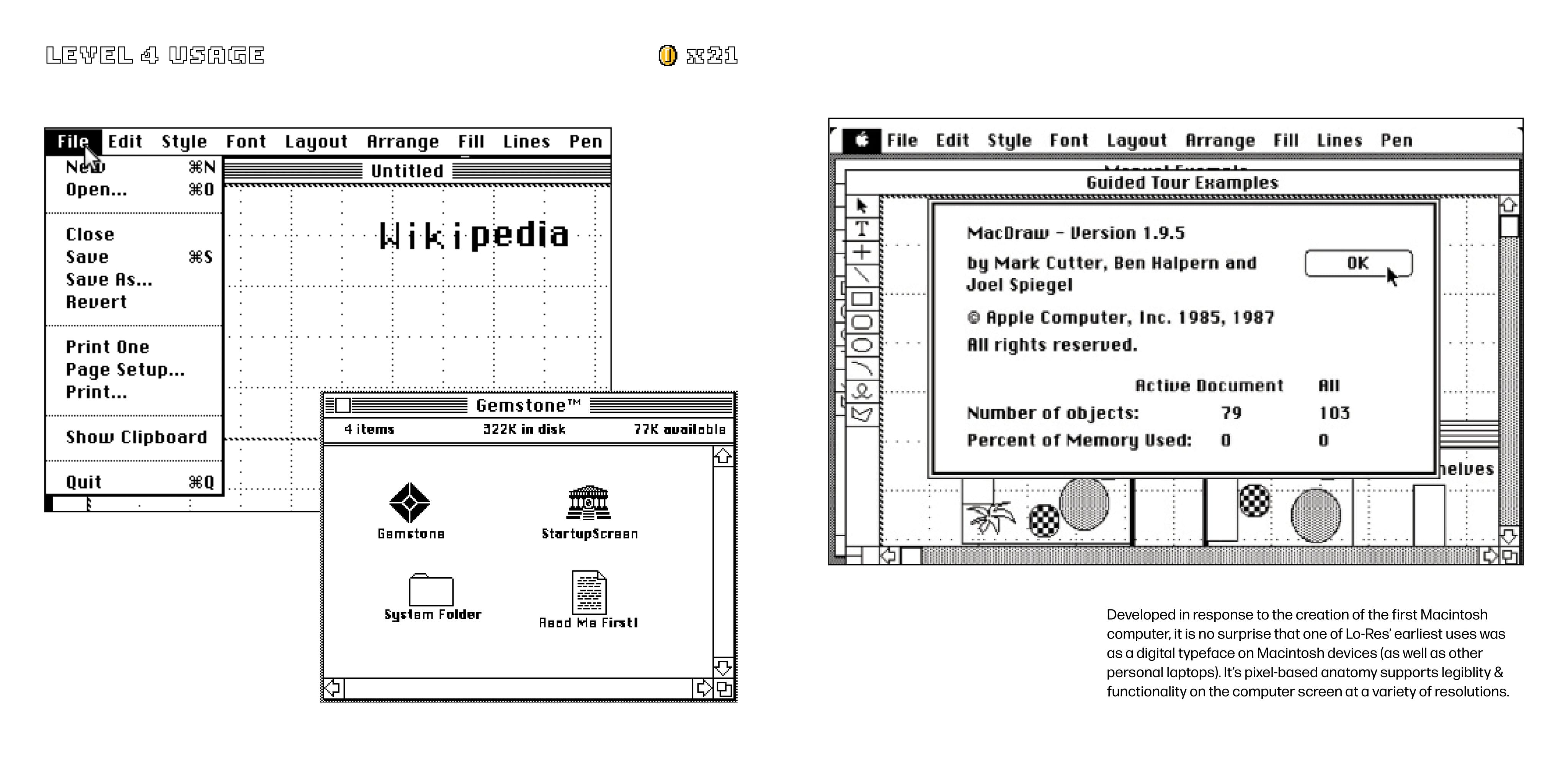
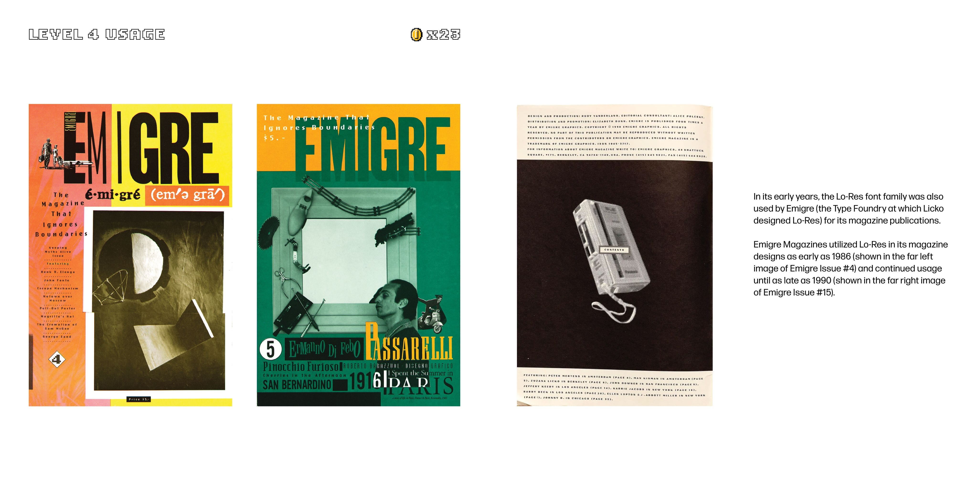
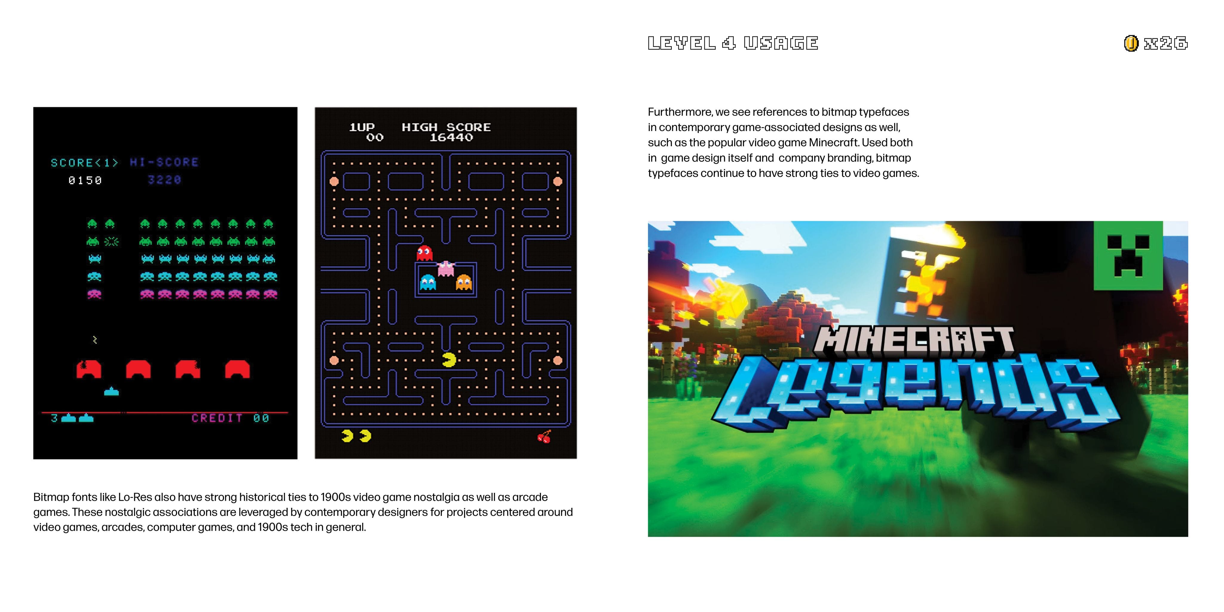
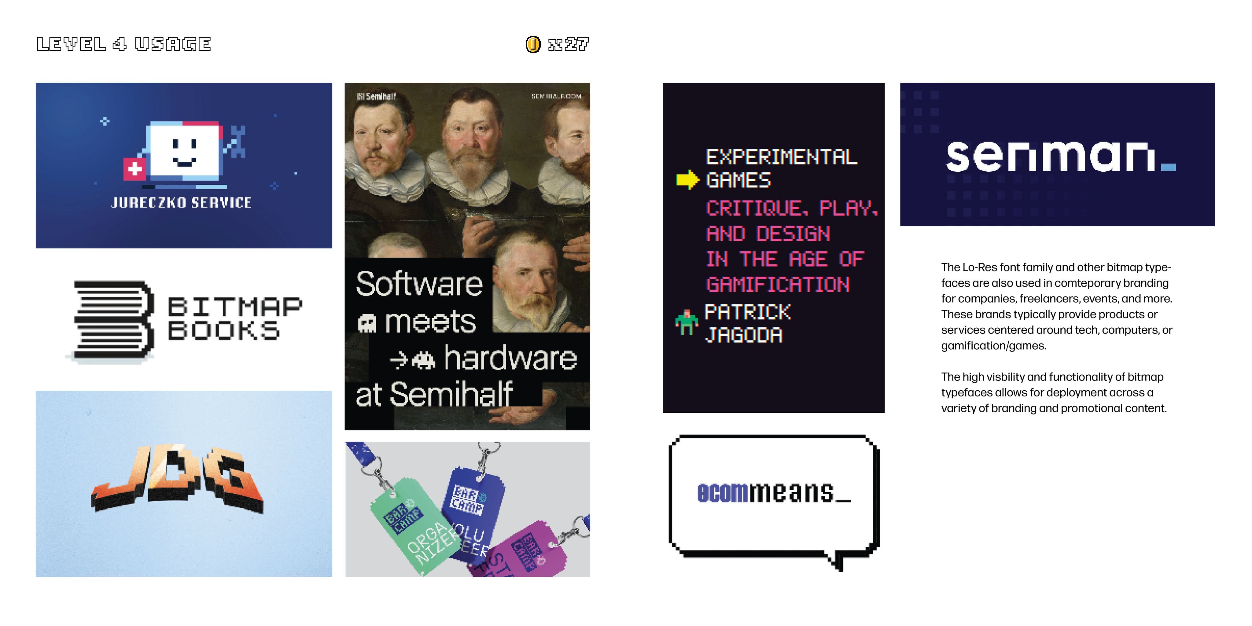
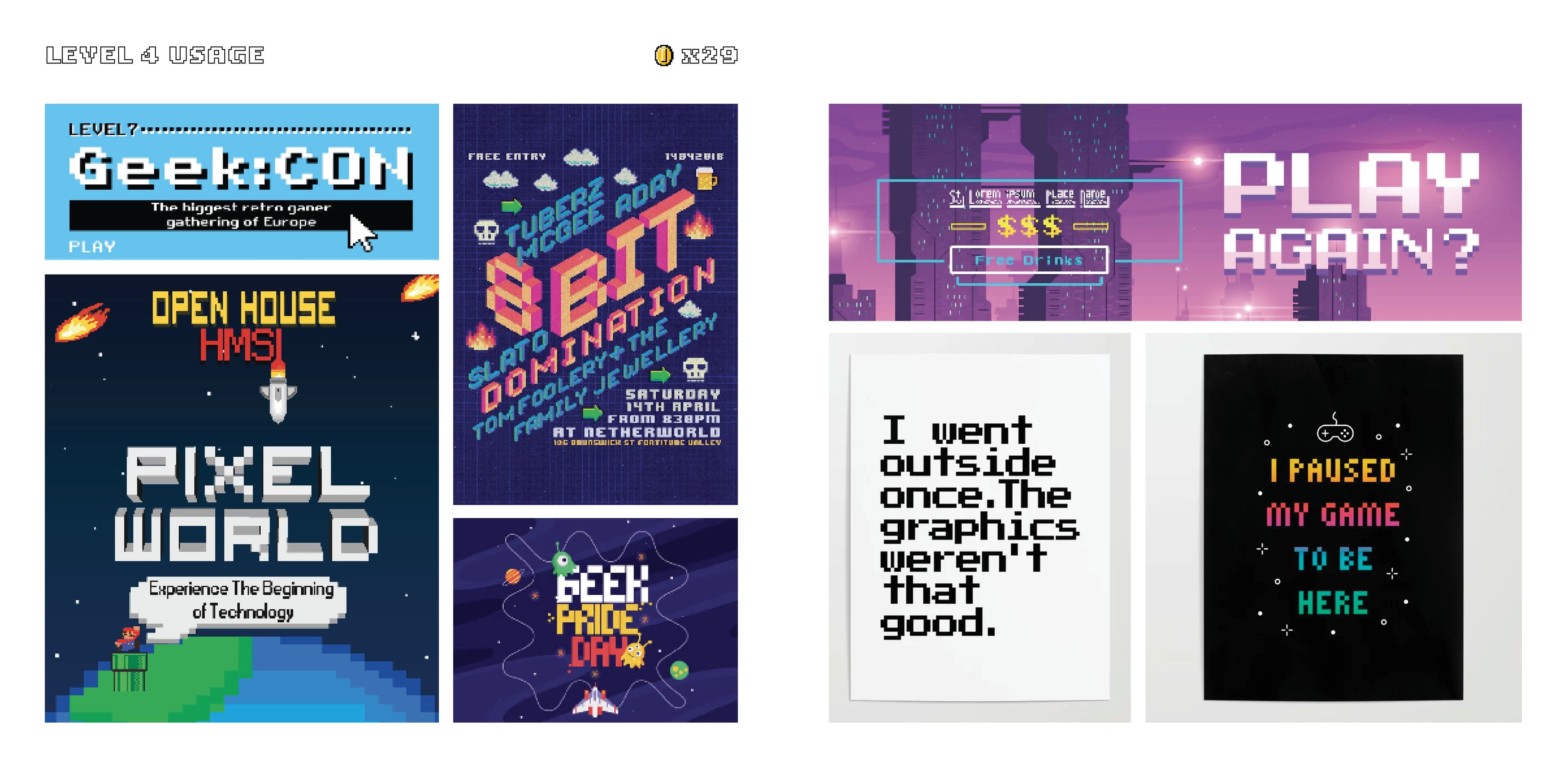
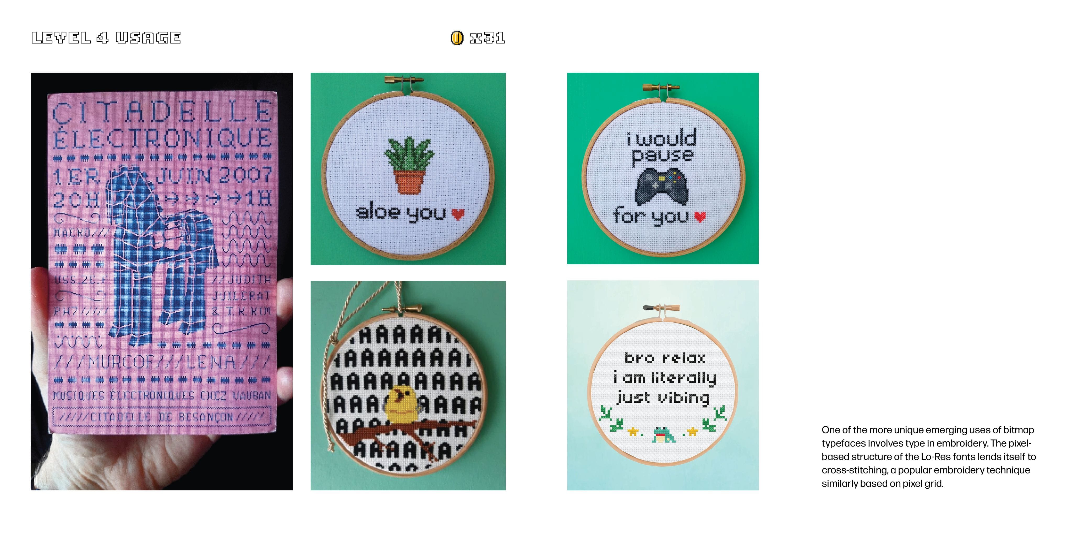
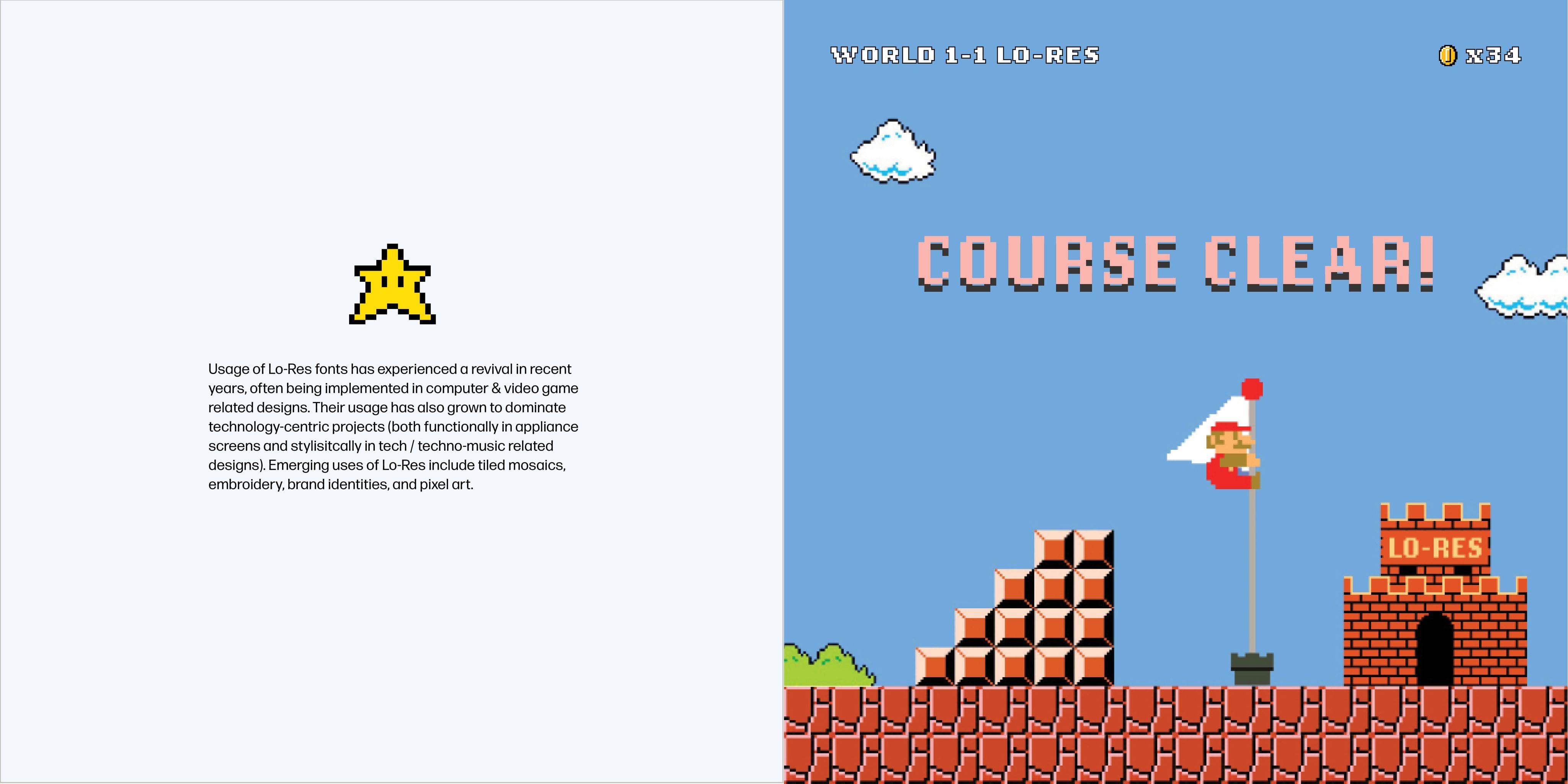
The Lo-Res font family is a synthesis of pixelated designs called Bitmap typefaces, which emerged with the introduction of the first Macintosh computer (and, thus, the need for digital type in the public domain). The Lo-Res letterforms follow the pixel grid structure of digital displays, creating the chunky, jagged geometry they are known.

Start Game...
Start Game...
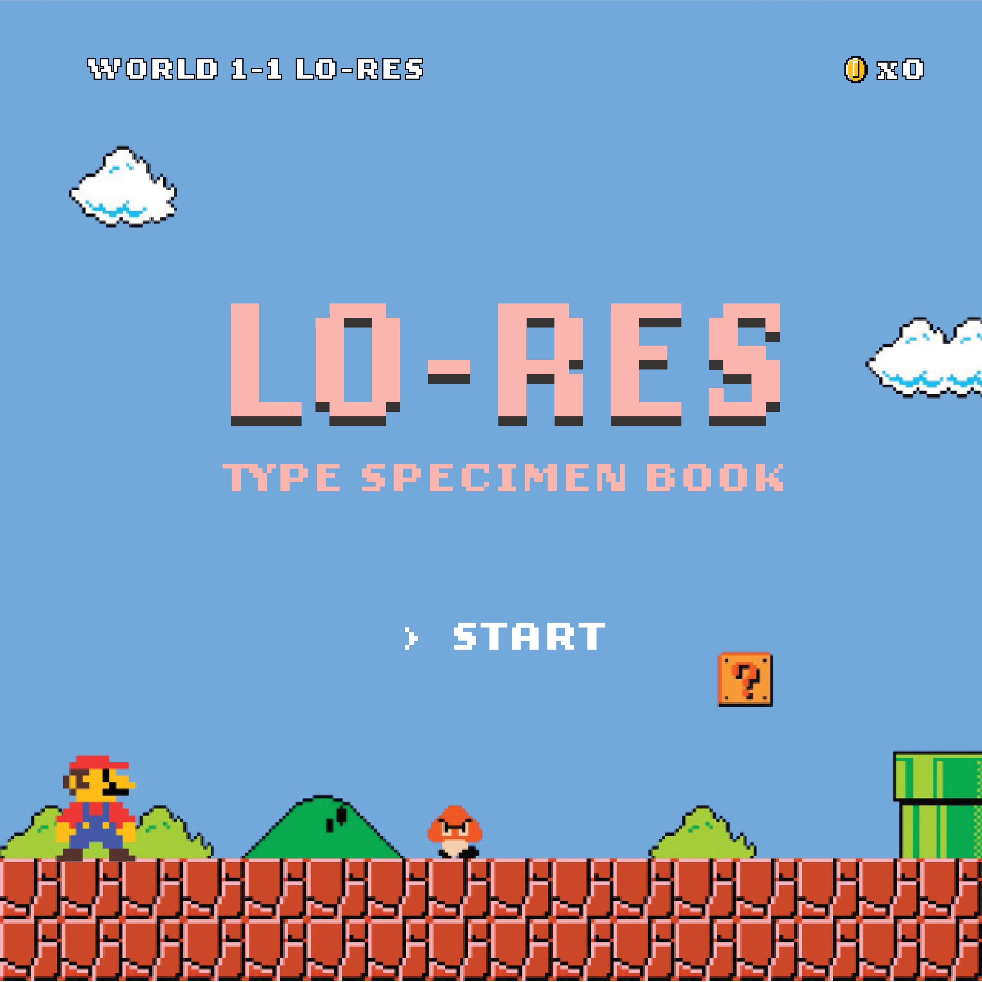
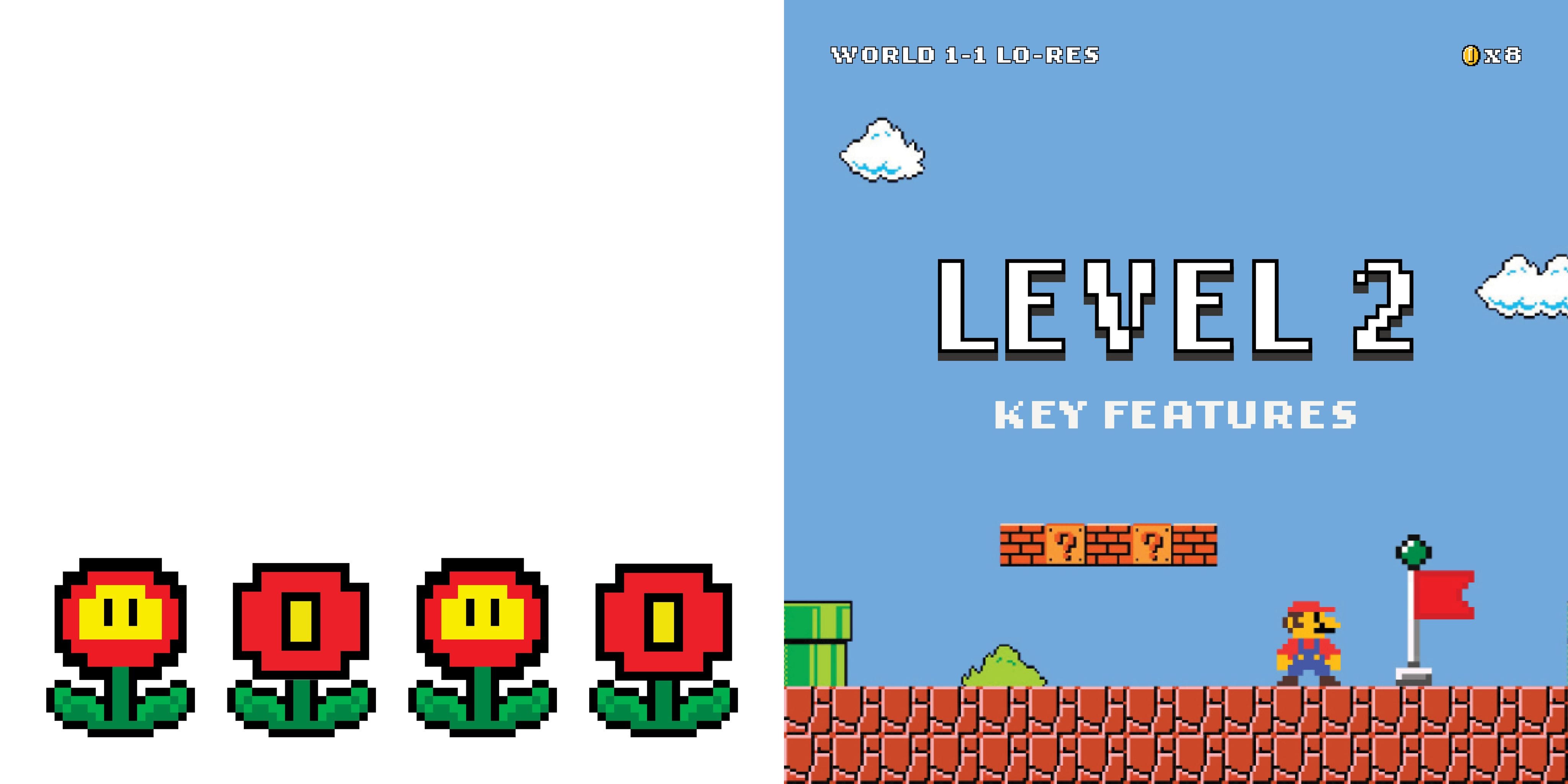
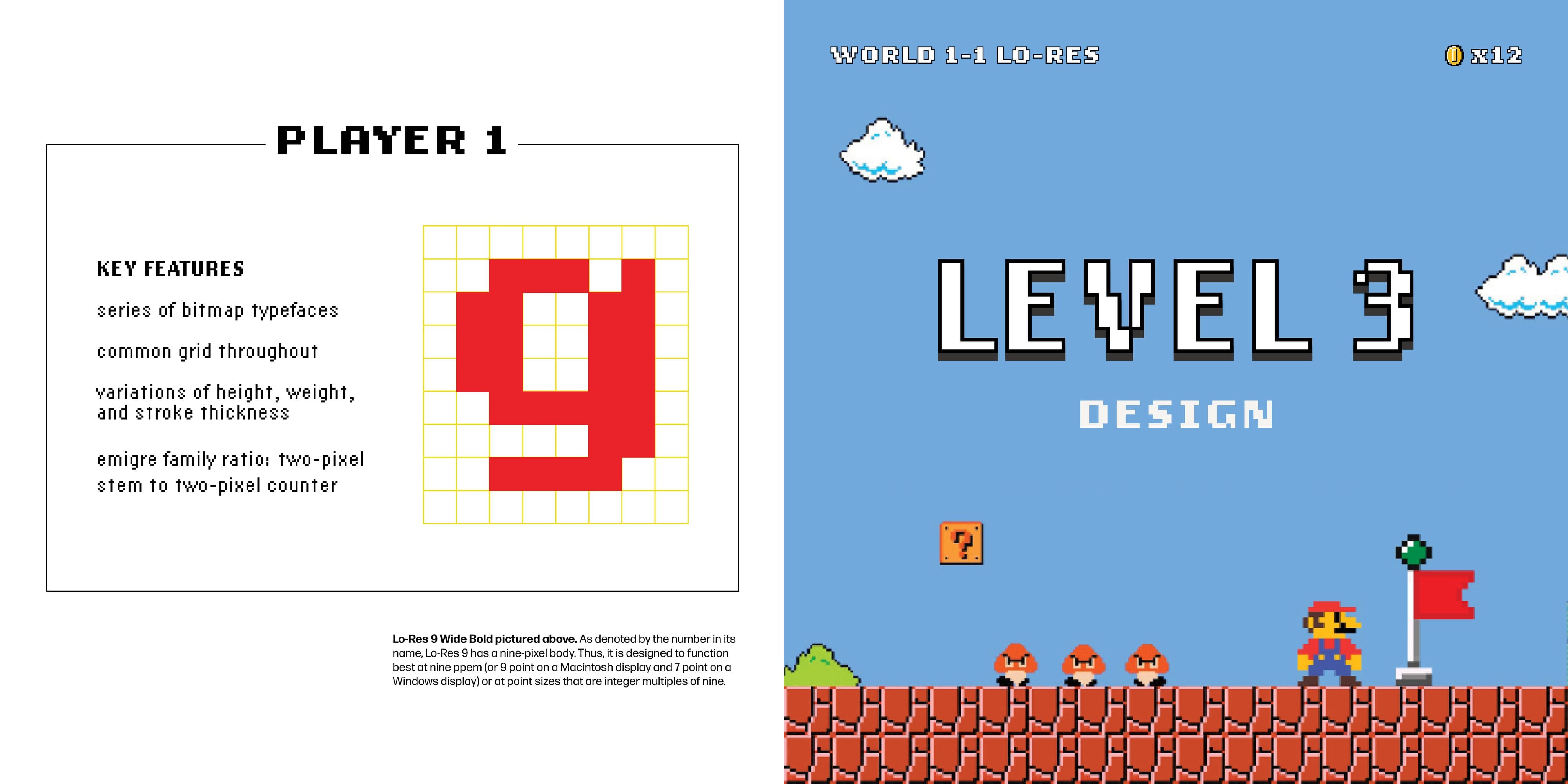
Telling the story of Lo-Res through a Super Mario Bros game metanarrative.
Telling the story of Lo-Res through a Super Mario Bros game metanarrative.
The book design and packaging use storytelling to immerse viewers in the world of Lo-Res. The packaging sets up the metanarrative through familiar visuals and a copy style reminiscent of game packaging.

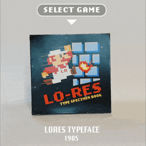

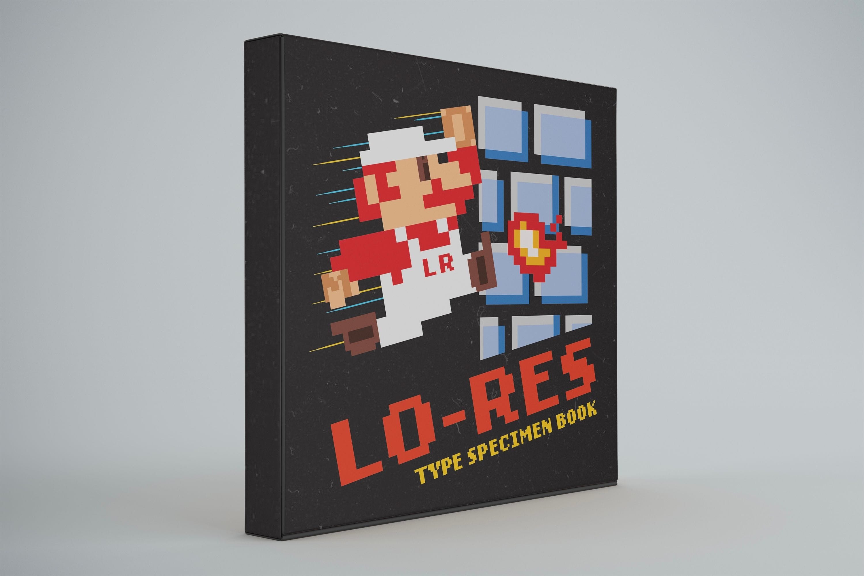
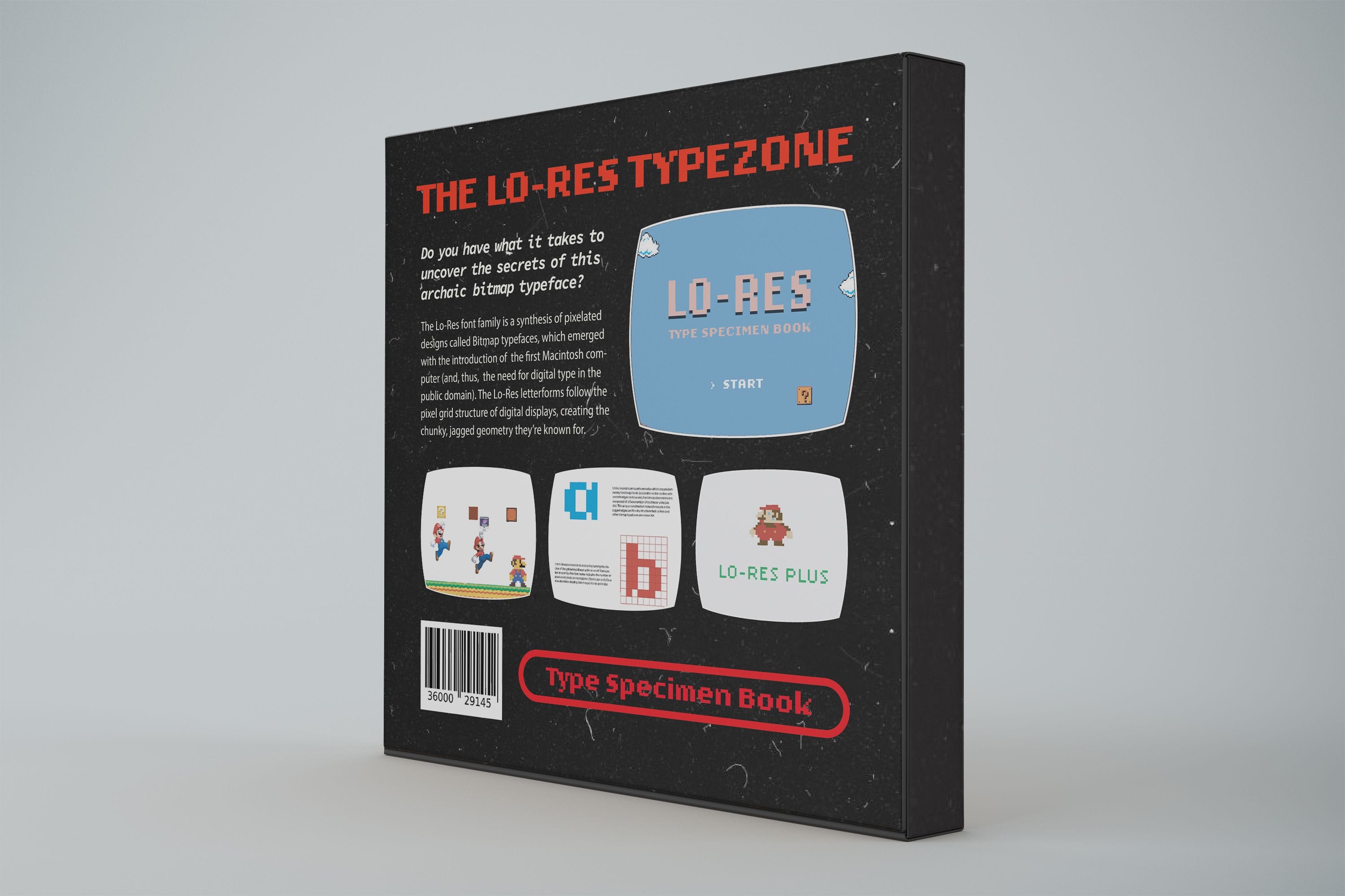
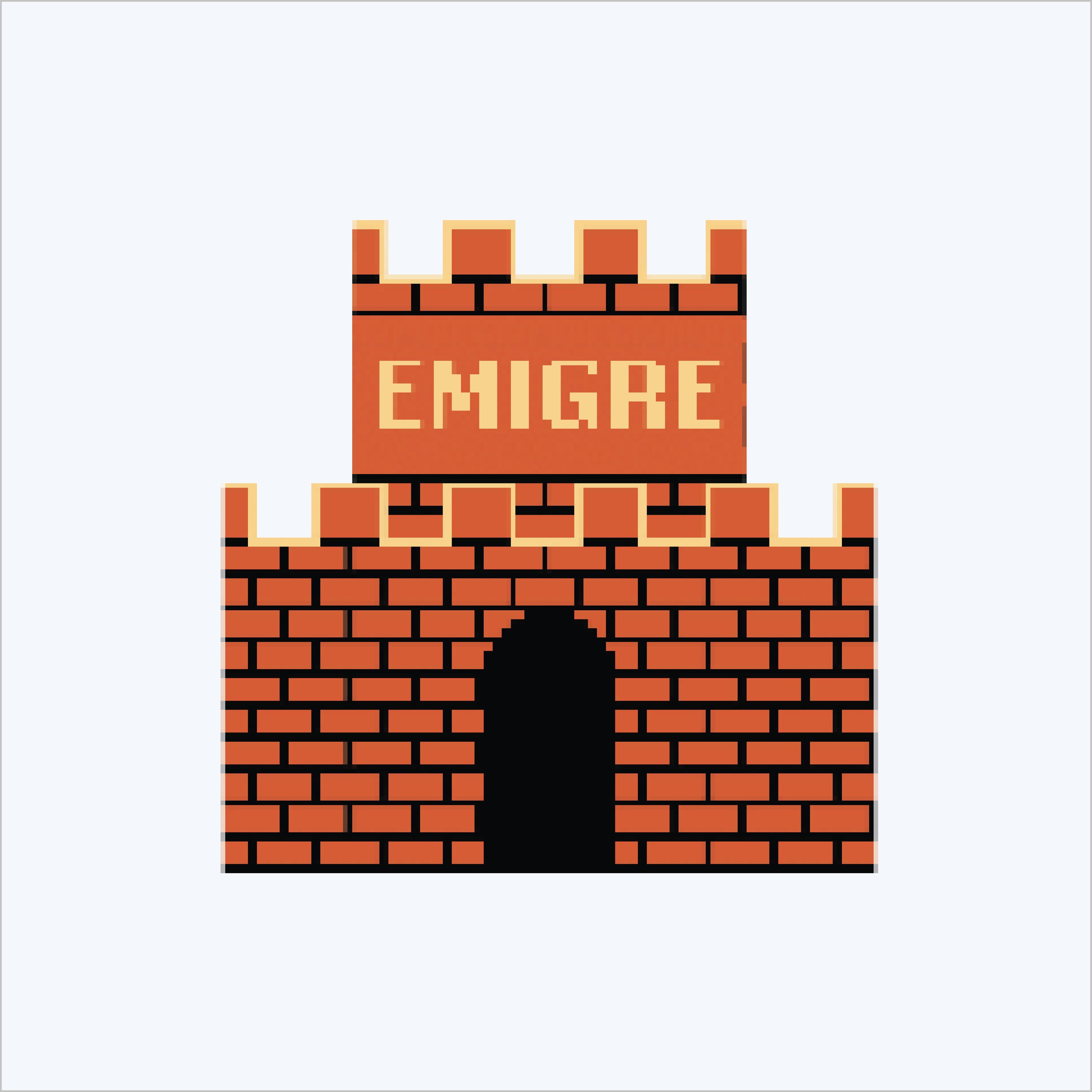
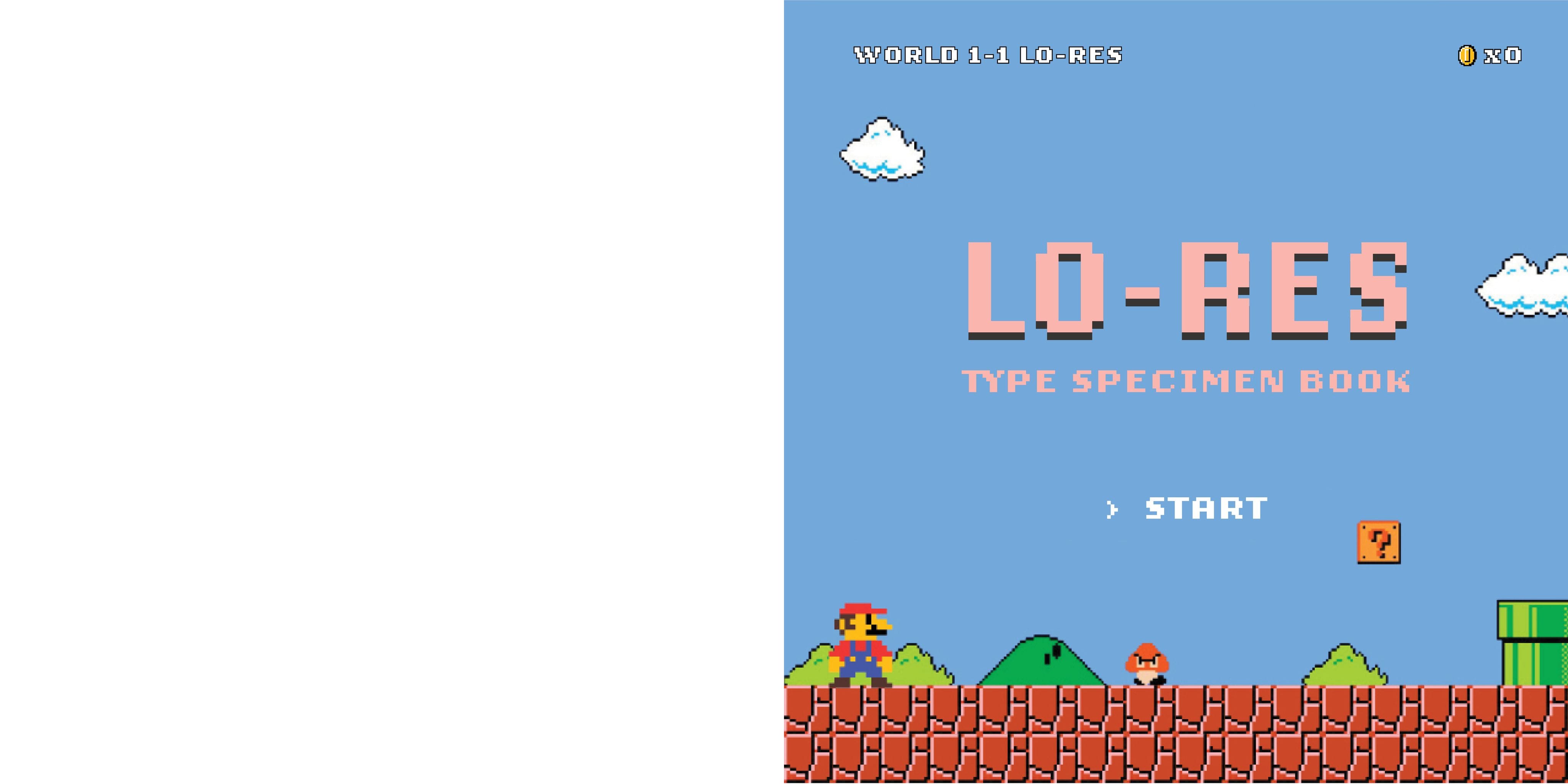
Book sleeve as visual reference to the original Super Mario Bros. Nintendo video game box packaging.

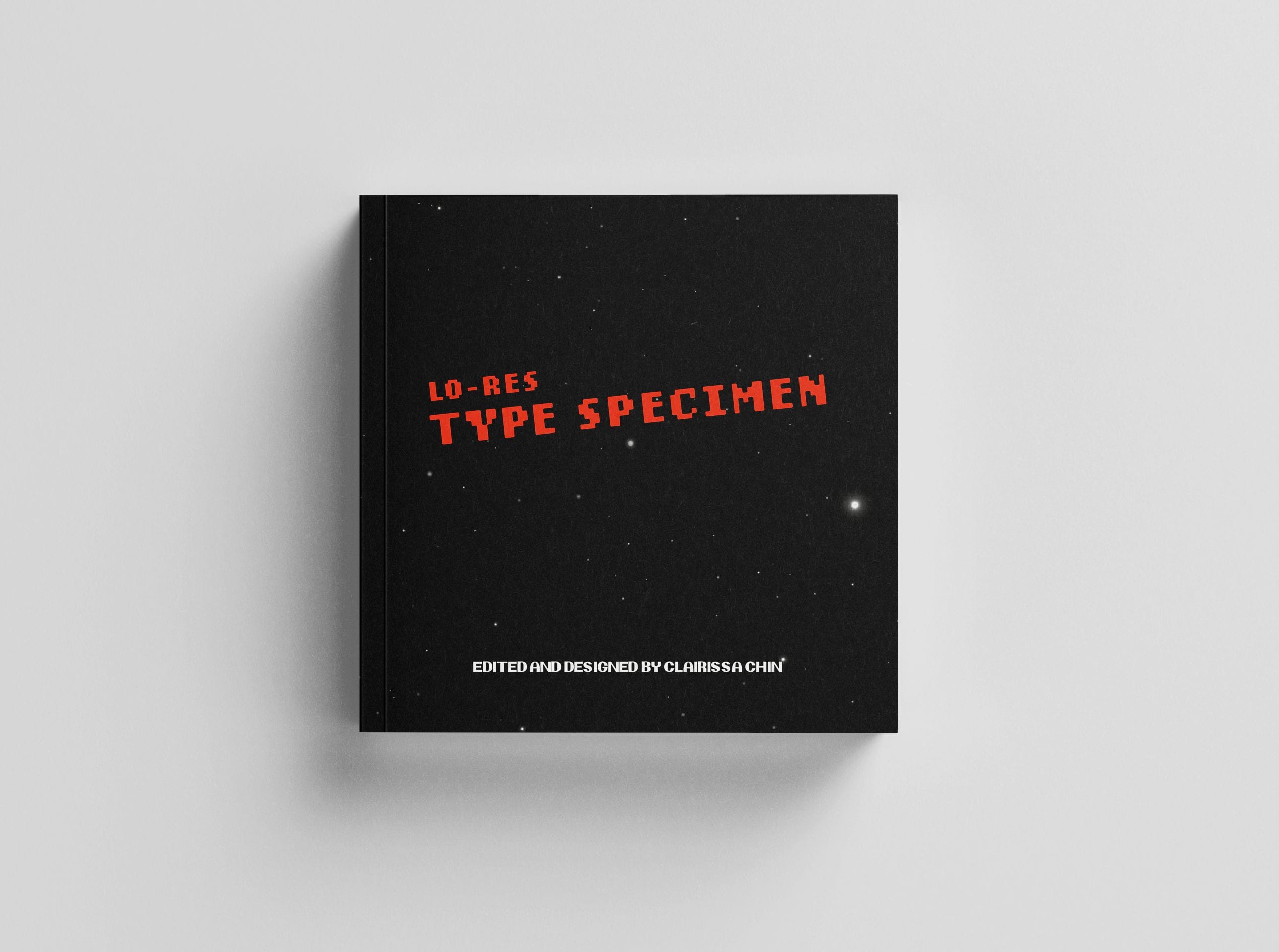
Book cover references the original Super Mario Bros. Nintendo instruction pamphlet.

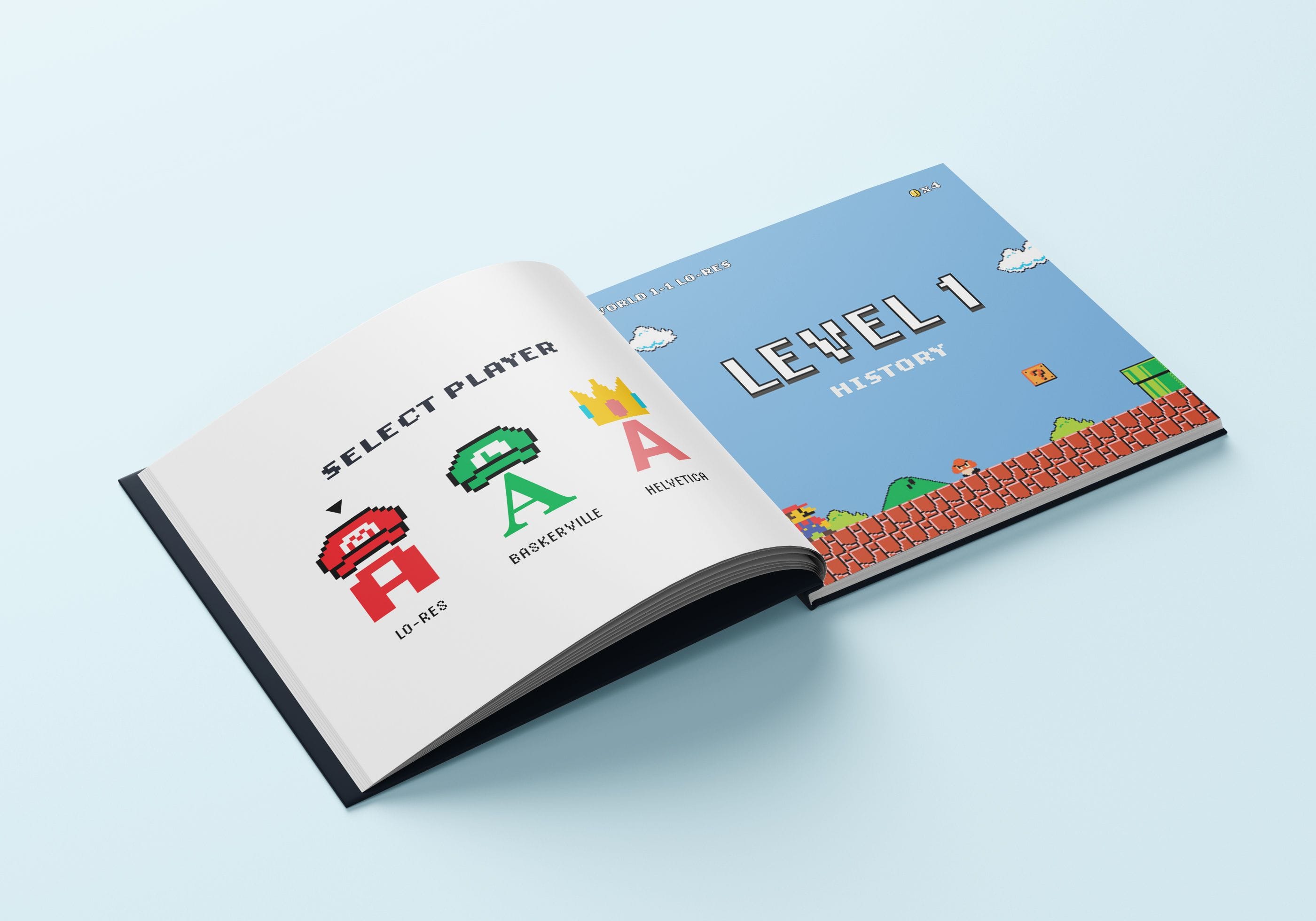
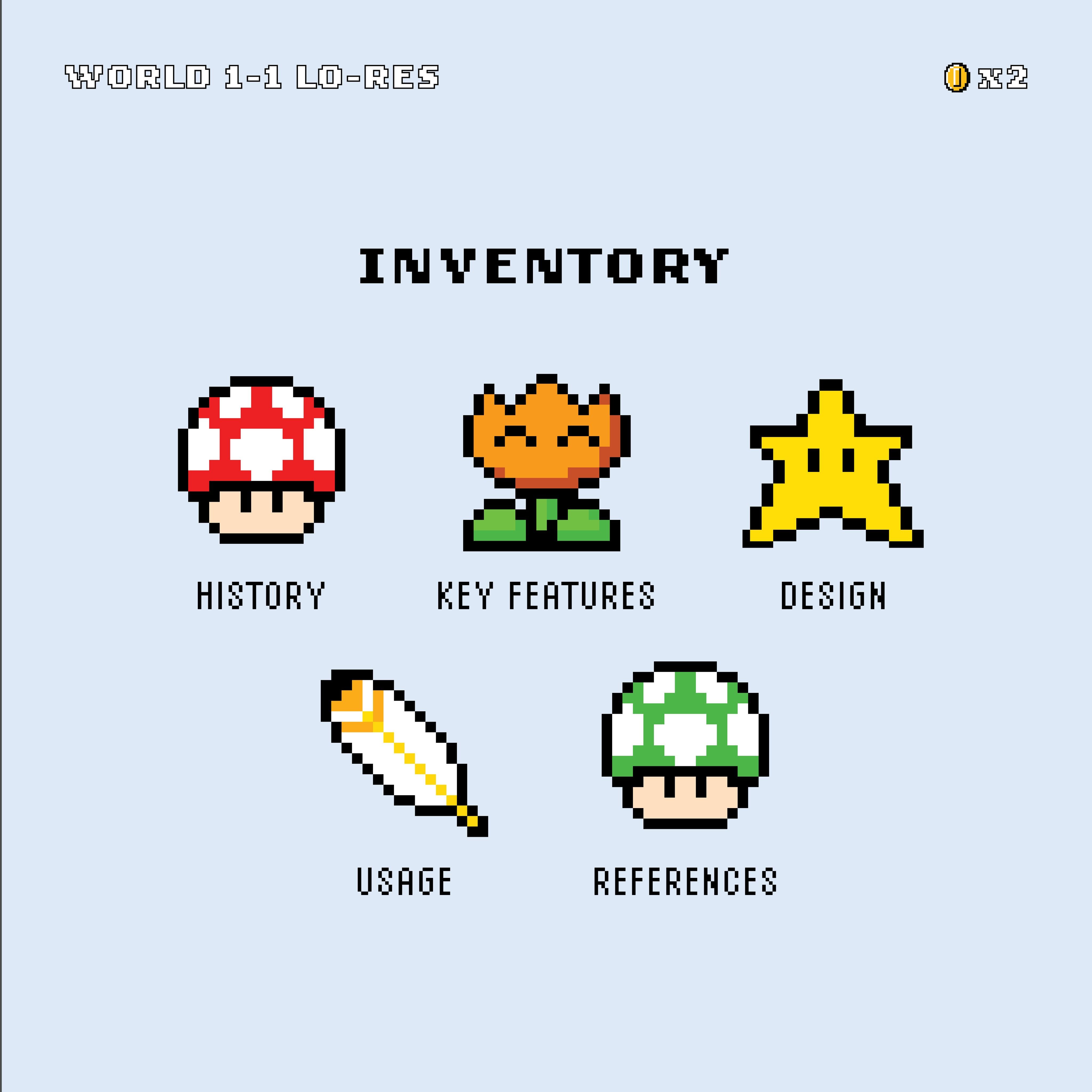
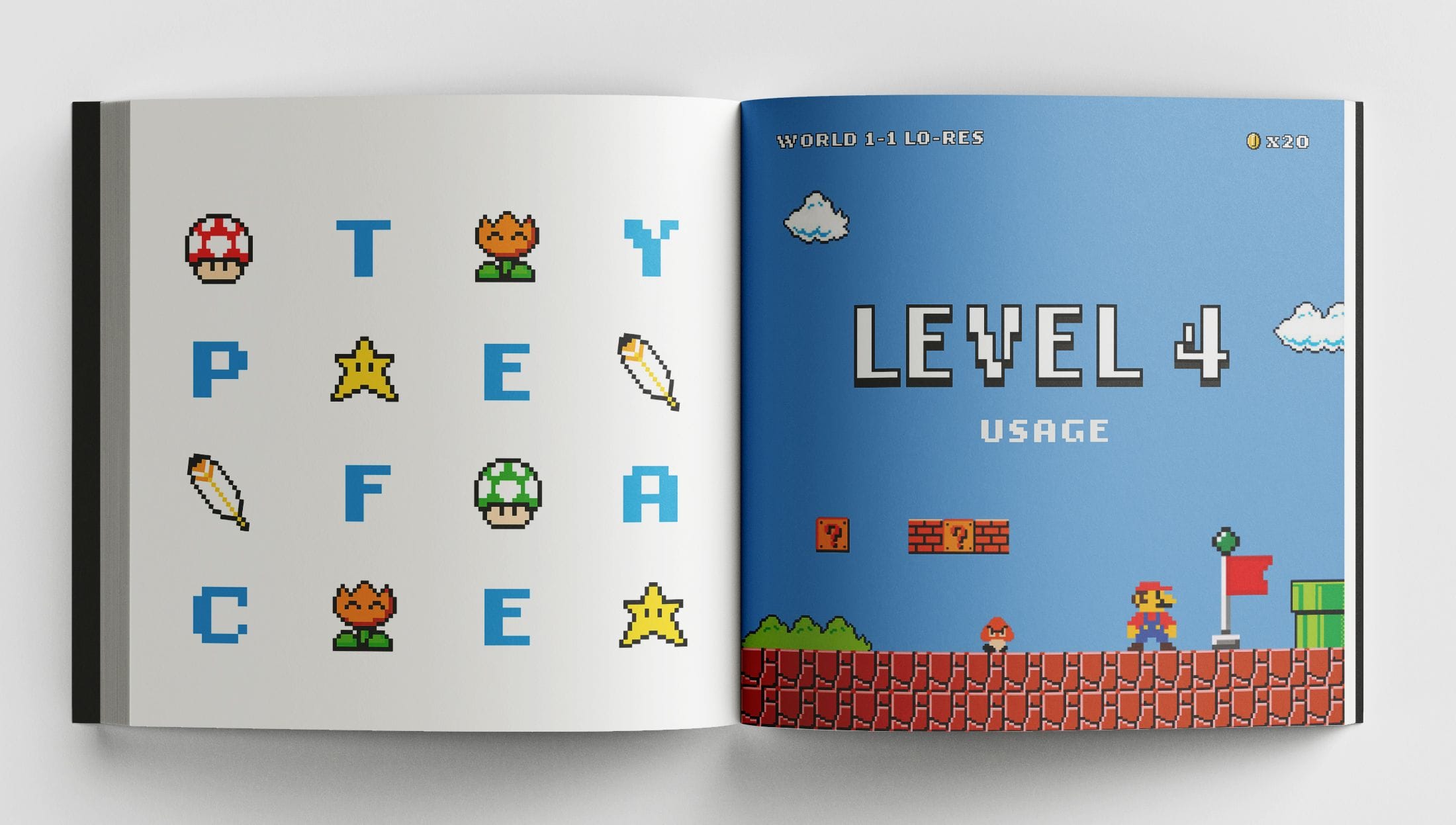
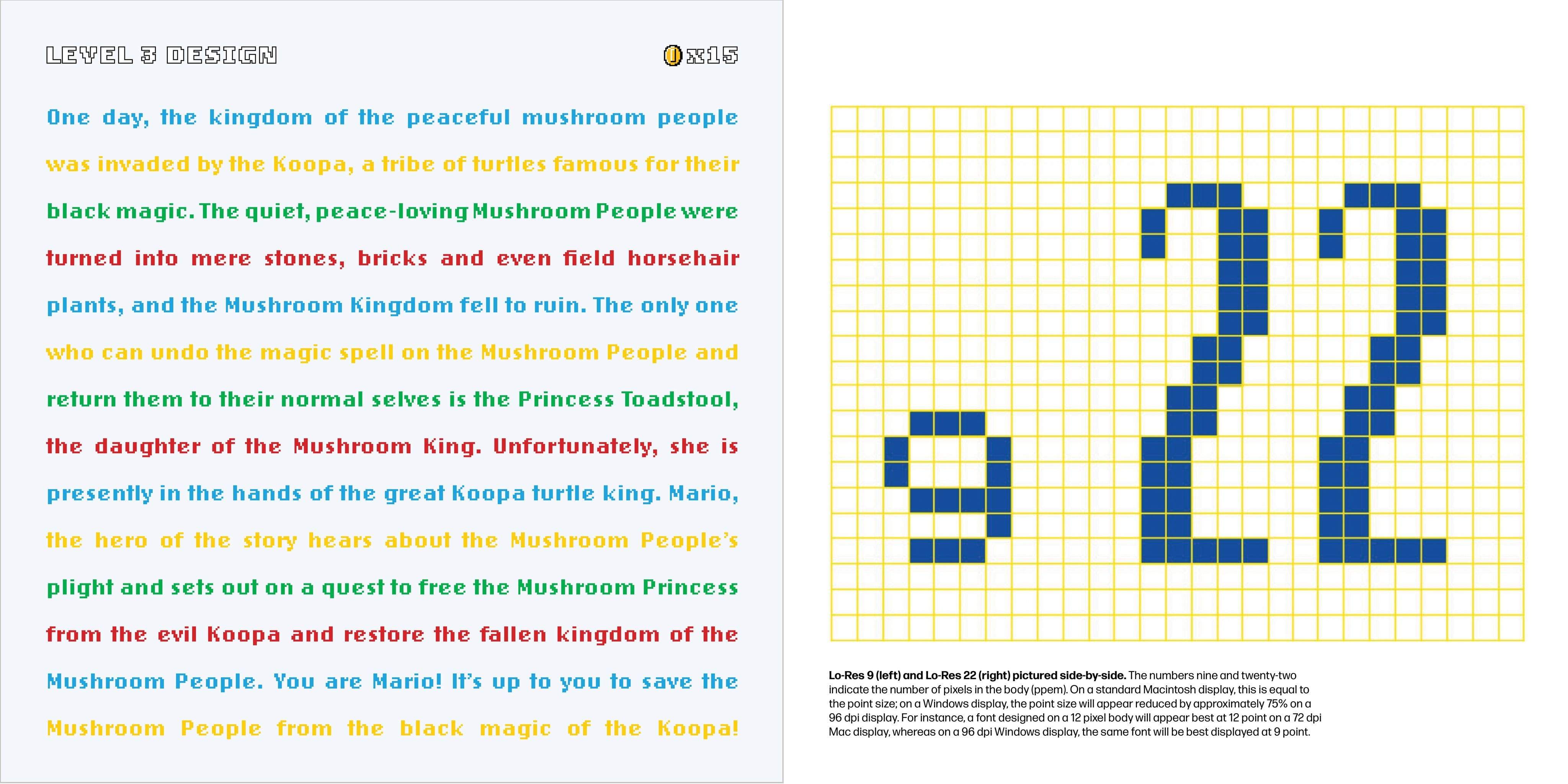
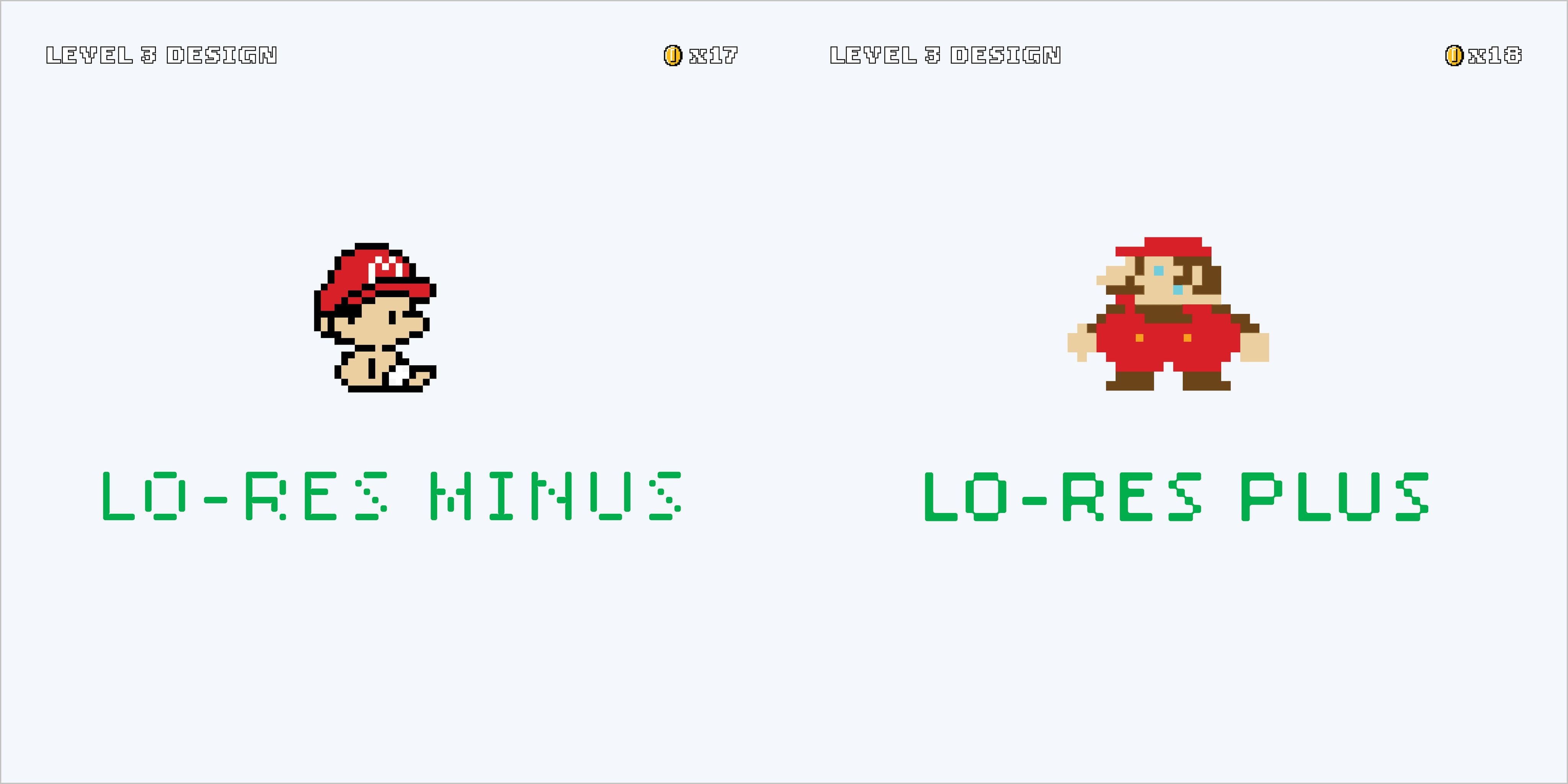
In the interior spreads, a running header tracks the viewers’ level progress (ie: the book section) and accumulation of “tokens” (ie: page numbers).

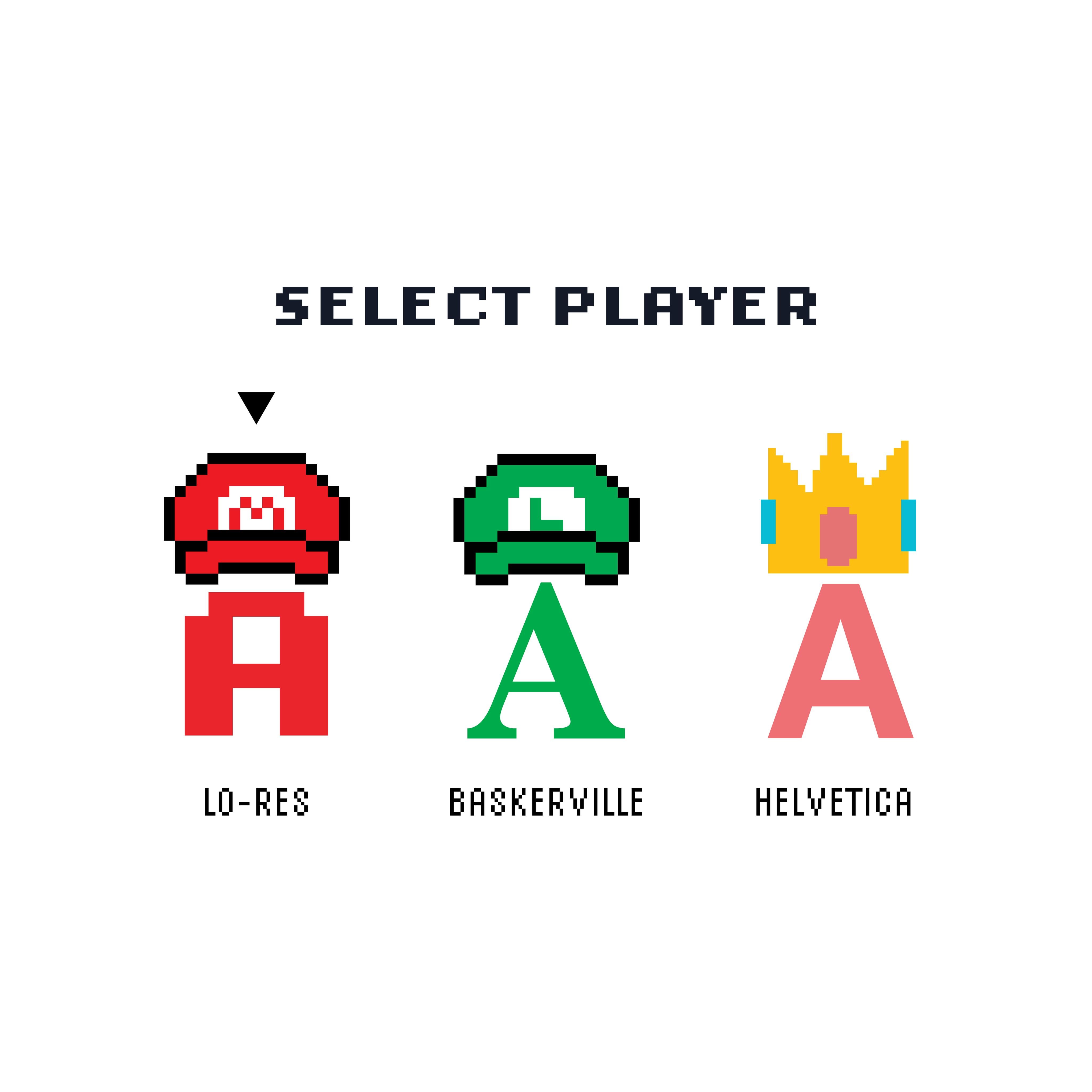

Illustrations add an element of graphic wit throughout the narrative.


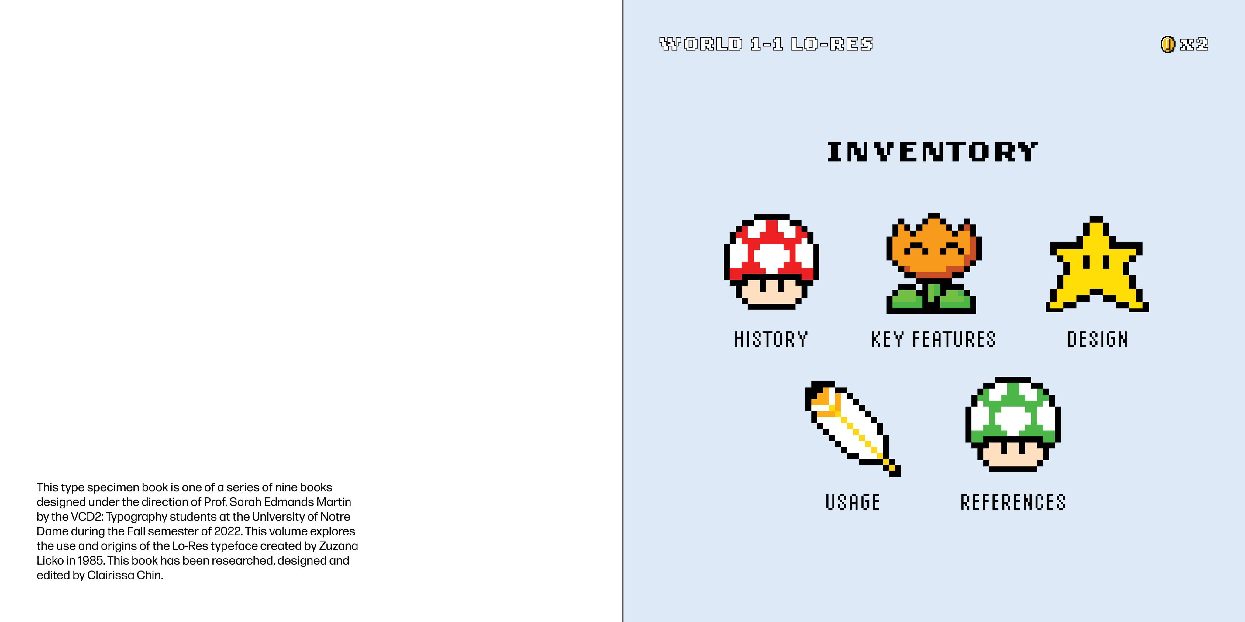
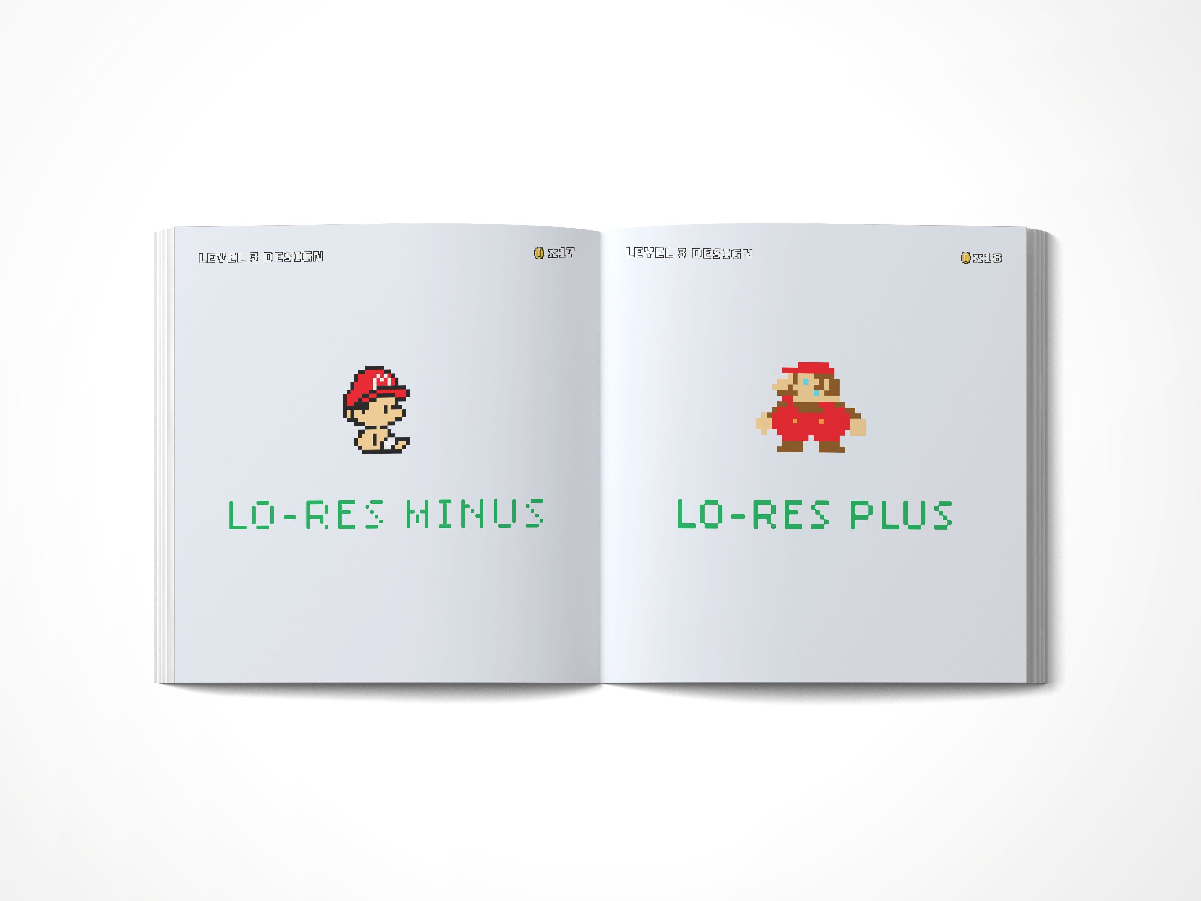
Flat Spread Designs

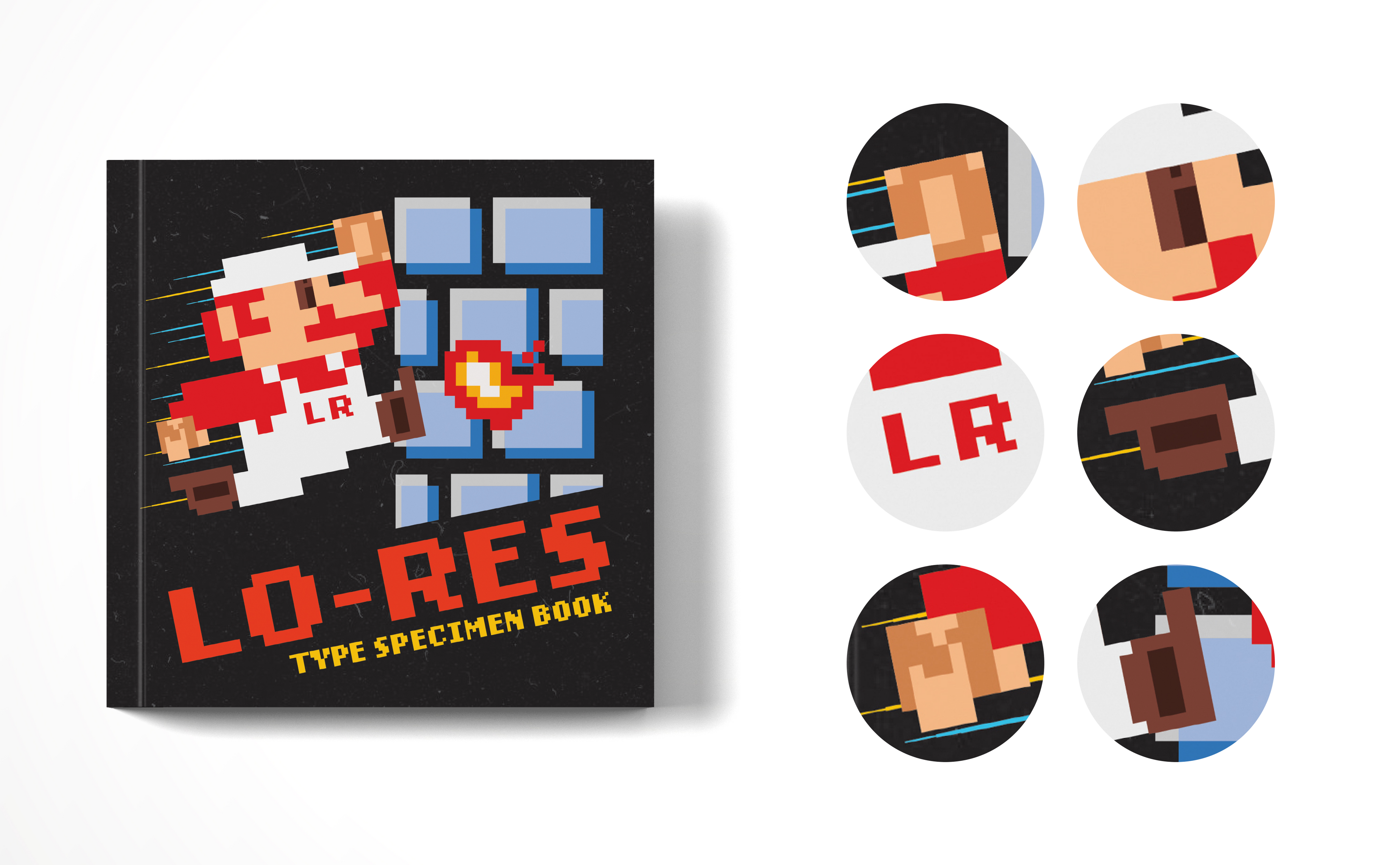
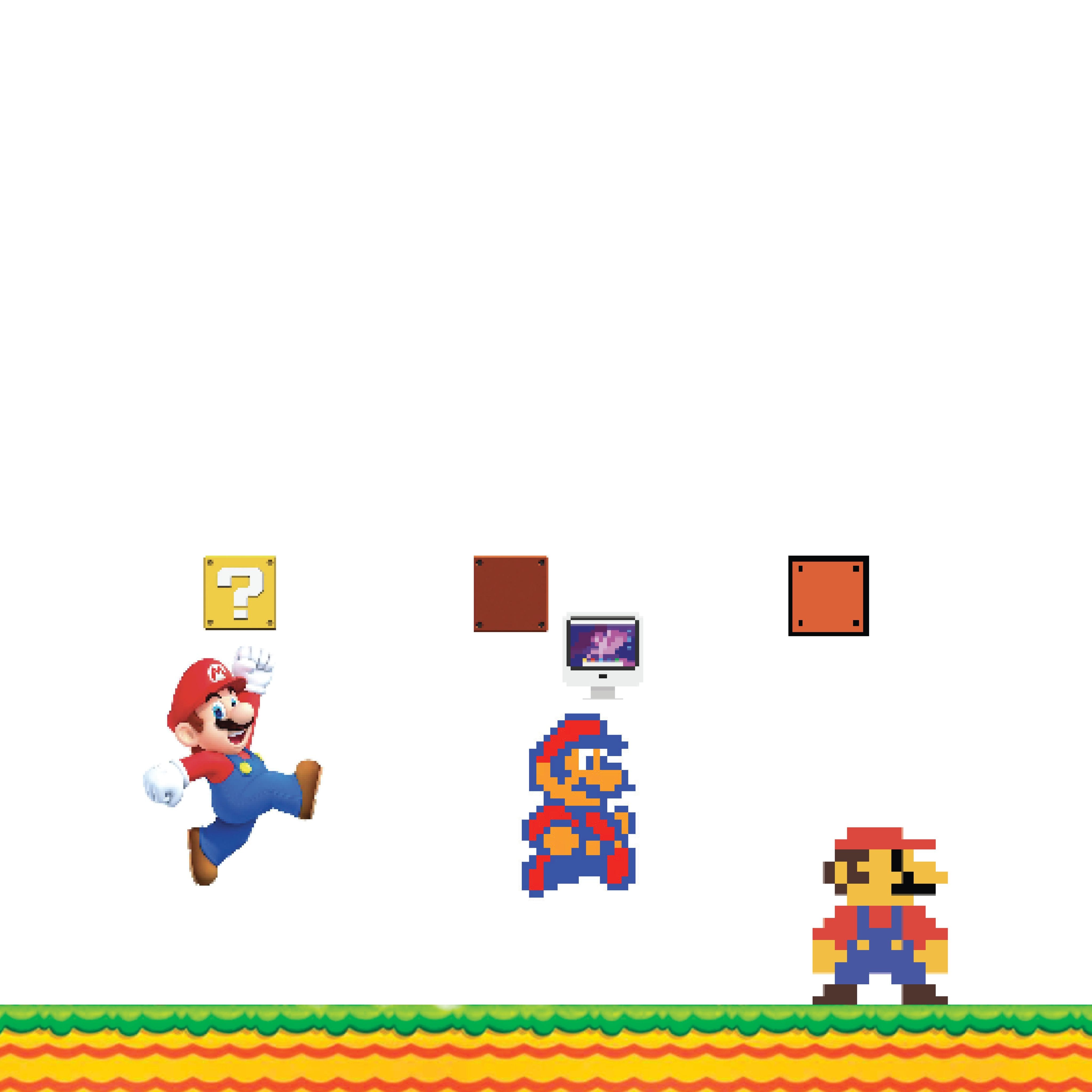
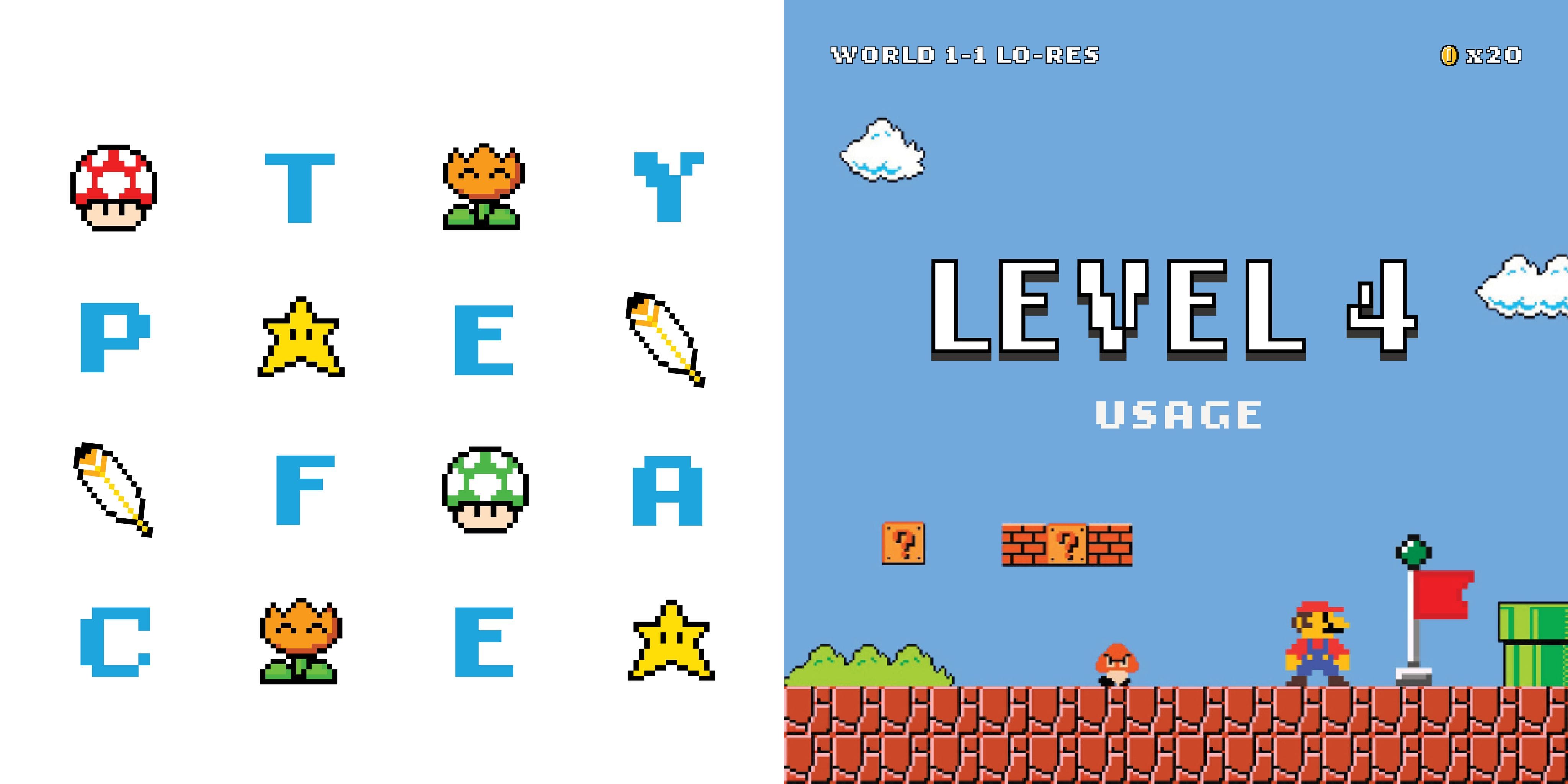
Pssst. Did you spot all the hidden letterforms in Mario?